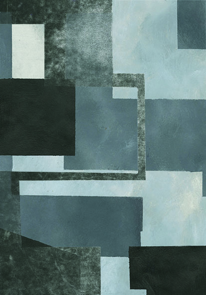
I am reasonably happy with my outcomes for this brief, and think they tie together the various elements and processes I was exploring in a cohesive and uniform way which I think capture some of the ideas and themes I wanted to express effectively. I'm glad that I didn't finish the brief and prefer some work that I did much earlier on (which tends to happen to me often), these pieces definitely feel like a culmination and I was happy with how the monoprint textures work with the shapes.
 |
| Final Poster |
I decided that the reason some of my earlier painting was not working in as much of a dramatic way as I wanted was because the shapes filled the whole page which flattened the image somewhat, creating more of a pattern than i was intending. So, when I started working on the final outcomes, I went back to studying some photographs of Goldfinger's buildings to try and re-position or re-ground myself. I had been working in such an abstract way, without reference, that I was finding it hard to capture what i wanted to. I think it worked as well, this final poster image is actually a view looking up at Trellick Tower from an extreme angle and I think it helped me capture a more looming, dominating form which is what i was after. Using a bigger variation of angles (not just right angles, as I was using in my more abstract paintings) also makes the imagery much more dramatic and present I think. I kept the background a sort of ambiguous blend of grey, slightly bluish tones to hint at sky. This was, A, to make the really accentuate the steep angle and literal height of these types of apartment blocks, and B, to reference the idea of brutalist architecture creating 'streets in the sky', envisioning a modern way of living by which humand activity would be built upwards and free up ground space for natural land and parks etc. , alluding to the massive ambitions of brutalist architecture.
 |
| Postcard 1 |
 |
Postcard 2 - this i think was my weakest image. It doesn't feel quite immediate
or commanding enough and the picture itself is too literal, so it loses that
sense of conveying and idea, character and atmosphere and just seems to be
representational. |
 |
| Postcard 3 |
 |
| Stamp 1 |
 |
| Stamp 2 |
 |
| Stamp 3 |
 |
Stamp 4 - This was one of my favourite images i created out of the whole set
and I toyed with the idea of using this as the poster briefly. In the end though
I decided that this much more abstract approach worked better for the stamps
than the slightly more representational stuff because the boldness of those
images would have been contradicted (and subsequently lost impact) by such
a small scale. |
Overall I am happy with the outcomes for this brief. My only issue is that they didn't print particularly well and, as a result, quite a lot of texture has been lost. I haven't seen the final poster printed out yet as I haven't got it back from digital print, hopefully that has printed a lot better. The rest of them i printed on the standard studio printer and I'm hoping that's why the quality isn't there and that the poster will come out much better.


No comments:
Post a Comment