Tuesday, 28 March 2017
OUIL6 Final Evaluation
I have enjoyed the Visual Communication
module and I think it has included the largest amount of exposure to processes
which were previously unfamiliar to me, which has been challenging but
ultimately rewarding. In fact, I think all of the briefs within this module
required me to use methods which I either hadn’t used before, hadn’t used to
the same extent or hadn’t used for a long time, which meant I didn’t really get
bored of the work I was doing throughout the whole duration of the module.My feelings towards my three outcomes for
the GIF brief are mixed but I hadn’t done any animation since I was about twelve
so it was fun to have a go at it now, from a different perspective and with
much more creative experience, in general, under my belt. My favourite of the
three was definitely the hand drawn one, although I didn’t plan it particularly
well and, as a result, ended up spending much more time on it than I initially
intended, and a disproportionate amount to the other two GIFs. I actually found
it very hard to think about how a person walks and got very caught up in that
particular challenge, which meant that the final result was still in fairly rough
pencil drawings. I liked the effect of this though, and that aesthetic seemed
to fit nicely with the strange, surreal movements of the character. In a similar
sense, the inconsistencies between my drawings in each frame caused the figure
to wobble and almost morph as it walked, which again actually ended up working
in its favour I think. My digital GIF, whilst a little boring, definitely
worked the most effectively as a repeating GIF out of the three. The way the
feelers’ movements loop into each other is pretty fluid and although I don’t like
it as much, it probably answers the brief a little better than the hand drawn
one, which is more of a short animation than a repeating GIF. The 3D GIF was
fairly weak I think, although it had potential. I underestimated how difficult
it would be to animate a model I had made and the frames were all wobbly
because I didn’t have a tripod. I should have planned it better and rented a
camera from college, but I had left it a little last minute because the hand
drawn GIF had taken up so much time. I think delegating time appropriately is
something I need to work on in general.I went into the ‘Acts of Kindness’ Brief
expecting to hate having to use illustrator, and whilst it definitely came with
its fair share of frustrations, I didn’t actually hate it as much as I thought
I would (although I did end up hating the fact that I was spending all day
looking at a screen). I found Illustrator to be a useful way to provoke
different ways of thinking about image making; in particular, having to think
in terms of closed shapes. I ended up happy with the result, at least aesthetically,
but I do think that it fails somewhat to represent the idea behind it and
perhaps seems a bit lazy conceptually. I feel the last brief was largely
successful, although I wish I had taken it a little further maybe, for instance
tried making concrete or just some 3D processes in general, or maybe used
photography more (I only used a tiny bit). I know I definitely would have tried
out those things if I’d had more time but I didn’t get around to it. I think I
need to start doing things when I think of them more often because I often plan
to do stuff when I’m feeling particularly inspired, but then a few days later,
when I’m not, I just procrastinate and don’t act on those plans. I got really
quite interested in Erno Goldfinger, so found researching him to be enjoyable
and I think as a result, I’m really happy with a lot of the sketchbook and
preliminary work. Also, this might be one of the few projects where I feel like
the outcomes are justified and incorporate the various elements of my research
and practical work in the right way. I also used acrylic paint a lot, as well as
play around with some monoprinting, which are both processes I don’t usually
use, so I feel like my research definitely lead me down some specific practical
avenues which were well considered.Overall I have think the Visual Communication module
has been largely successful and I really enjoyed the fact that using unfamiliar
processes and techniques pushed my work into numerous different places and made
me think in several drastically different ways whilst I was making work.
Final Poster Digital Print
The digital print of my final poster messed up. I bought a memory stick from the library to put the file on to give to digital print and when I went to collect it the next day it turned out they hadn't been able to print it because the memory stick was 'kaput'. I took it back to library who suggested taking it to the IT guys to see if they could figure out what the problem was and it turned out that it wasn't formatted for Macs. Luckily (I thought) this was two days before the hand in so they re formatted the memory stick so that it would work with Macs and then I put the file on the memory stick again and returned to digital print. It seemed to work, we were able to actually get it off the memory stick onto the computer in digital print and it loaded so it would print. However, when i went to collect it today, it had printed, but there's a big pink line across the top which should not be there, it turns out it was like that on the file and the memory stick still wasn't really working. I obviously didn't have time to do another print though because i wouldn't be able to collect it until half past three tomorrow. I'm not really that bothered because it wasn't a mistake I made and you can still tell what the poster would have looked like. The colours did also print a lot better on that version than on the test versions as well, so if it wasn't for the big line it would be fine. The only other problem maybe is that because I printed the poster in digital print, but the postcards and stamps in the studio, the colours don't match.
Monday, 27 March 2017
Goldfinger final poster, stamps, postcards
I am reasonably happy with my outcomes for this brief, and think they tie together the various elements and processes I was exploring in a cohesive and uniform way which I think capture some of the ideas and themes I wanted to express effectively. I'm glad that I didn't finish the brief and prefer some work that I did much earlier on (which tends to happen to me often), these pieces definitely feel like a culmination and I was happy with how the monoprint textures work with the shapes.
 |
| Final Poster |
I decided that the reason some of my earlier painting was not working in as much of a dramatic way as I wanted was because the shapes filled the whole page which flattened the image somewhat, creating more of a pattern than i was intending. So, when I started working on the final outcomes, I went back to studying some photographs of Goldfinger's buildings to try and re-position or re-ground myself. I had been working in such an abstract way, without reference, that I was finding it hard to capture what i wanted to. I think it worked as well, this final poster image is actually a view looking up at Trellick Tower from an extreme angle and I think it helped me capture a more looming, dominating form which is what i was after. Using a bigger variation of angles (not just right angles, as I was using in my more abstract paintings) also makes the imagery much more dramatic and present I think. I kept the background a sort of ambiguous blend of grey, slightly bluish tones to hint at sky. This was, A, to make the really accentuate the steep angle and literal height of these types of apartment blocks, and B, to reference the idea of brutalist architecture creating 'streets in the sky', envisioning a modern way of living by which humand activity would be built upwards and free up ground space for natural land and parks etc. , alluding to the massive ambitions of brutalist architecture.
 |
| Postcard 1 |
 |
| Postcard 2 - this i think was my weakest image. It doesn't feel quite immediate or commanding enough and the picture itself is too literal, so it loses that sense of conveying and idea, character and atmosphere and just seems to be representational. |
 |
| Postcard 3 |
 |
| Stamp 1 |
 |
| Stamp 2 |
 |
| Stamp 3 |
 |
| Stamp 4 - This was one of my favourite images i created out of the whole set and I toyed with the idea of using this as the poster briefly. In the end though I decided that this much more abstract approach worked better for the stamps than the slightly more representational stuff because the boldness of those images would have been contradicted (and subsequently lost impact) by such a small scale. |
Simplification - Blowing a dandelion
I found this exercise to be useful for me in making the adjustment to working in illustrator on my sticker due to the fact that in illustrator one has to break everything up into layers/ components and think much more in a shape driven way rather than a linear one.
 |
| I started out just drawing the act of blowing a dandelion before gradually stripping my images back to the simplest forms and most essential information. |
 |
| The hardest part was trying to simplify the actual shape of a dandelion and the bits which fly off when you blow on one. I was also unsure about to depict a person blowing. |
 |
| I think I did a pretty good job in the end, bending the stem of the dandelion to insinuate the force from the blow worked pretty convincingly I think. I'm not sure i even needed the mouth really but then without it I think it would have seemed much less obvious that it's a dandelion, due to how much I reduced it's shape. |
Thursday, 23 March 2017
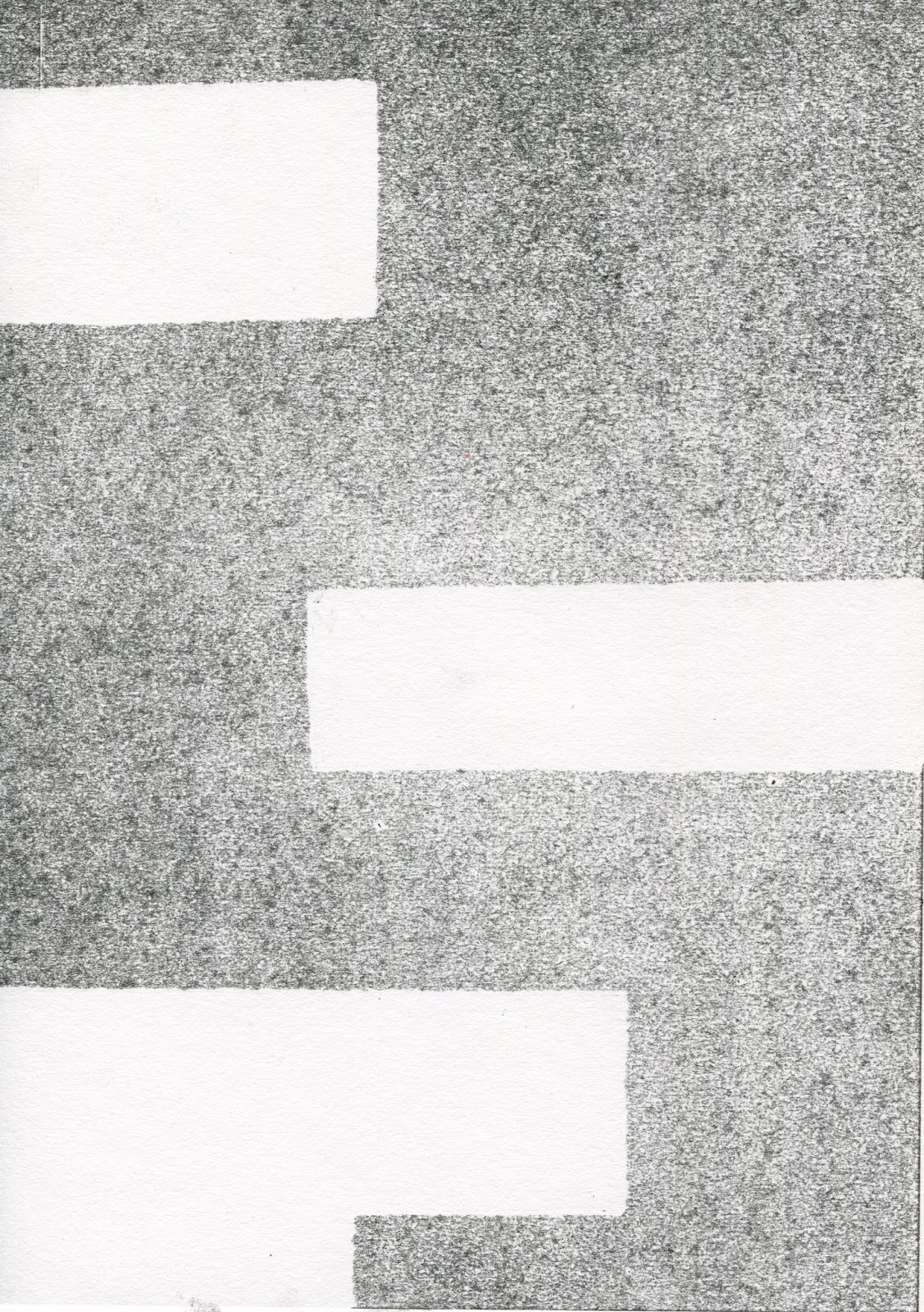
Goldfinger - Monoprint shapes/textures
I had a play around with some monoprinting to see what kind of effect it might give texture wise. I actually really like the grain I ended up with and even some of the shapes/compositions as well, even though I didn't put too much thought into these.
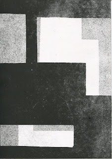


I think for my final poster I'd like to layer some of these prints over the top of an acrylic painting like the ones I've been doing, to add the texture, and maybe some more shapes within the boundaries of the main image. I might also combine this with some of the earlier shape based acrylic work.
I'm still not 100% sure about the postcards and stamps yet but I think I have enough material to work with an it will just be a case of trying different combinations.
Wednesday, 22 March 2017
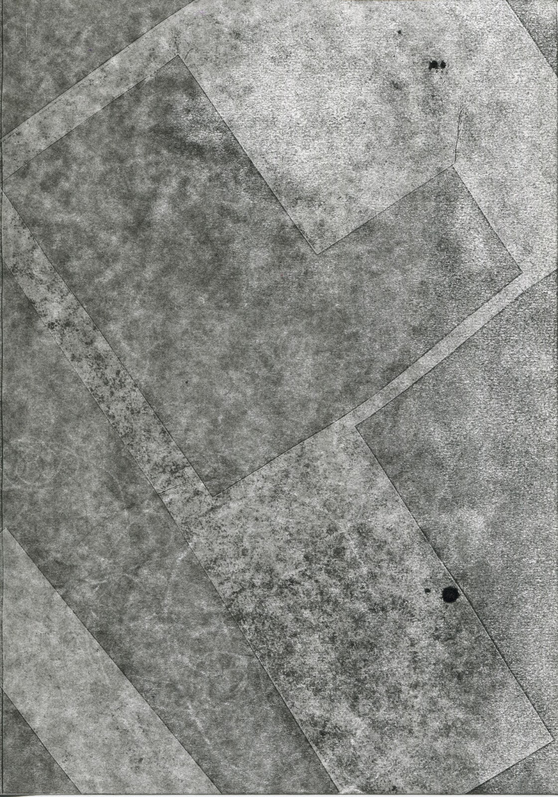
Erno Goldfinger - acrylic paint
I've experimented with acrylic paint to see what kind of textures and tones I can achieve and how well they might work to describe concrete.


I quite like the effect of using the paint so decided I would play around using the masking tape again to create hard edged, shape driven compositions to reflect brutalist architecture and hopefully provide a little more solidity than I had been able to achieve through the graphite and pen work.


using just black shapes over the grey base still seemed a little flat, so I tried creating some more interesting shapes. Whilst I prefer the work on the right as an image, it doesn't have the immediacy and density that I am trying to communicate.

Using white, grey tones with black helps bring a bit more presence, but it doesn't command quite enough so I decided that the best way to give these images a bit of strength would be to use the more interesting shapes but layer them up more.

And still more...

This last one is made up of shapes painted in more different grey tones, plus the black on top, and I'm starting to get the presence that I was aiming for. I'm still not sure that it looks brutal enough though. I've noticed that in these last few images, the greys have become more consistent and lost some of the texture that was in the earlier paintings. I'm also not sure about whether having this many shapes has made the work a bit too fiddly, looking a bit too reminiscent of early modernist structures as opposed to brutalism. I do like these shapes however, so, I think what I want to do for the poster, is create a bolder, more basic composition, and then lay these denser arrangements of shapes over the top, illustrating the heritage of brutalist architecture and specifically the work of Le Corbusier, who was a big influence on Goldfinger. I still would have to work on adding a bit of a dirty texture (the aesthetic of scuffed, aged concrete) over the top because I think Id also like to include the idea of time passing, the unrelenting dominance these buildings have over their surroundings, the almost timelessness of their appearance and the fact that many of them have become listed buildings and so cannot be knocked down.
Messing around on Photoshop
I found a piece of polystyrene packaging in my flat which sort of looked to me like it could be used to represent brutalist architecture due to it's shape and also the surface texture polystyrene has. I layered a bunch of photos of it over each other in Photoshop an messed around with the colours, also adding in some motifs from some of Goldfinger's buildings ove

I think this went ok as an experiment but I'm not sure its really worth taking forward, although I might try and incorporate the over laying element in some of my final outcomes, as i like the way all these different blocks of tine are created through that.
Monday, 20 March 2017
Erno Goldfinger - more ideas
I made some more work in response to the plans and architectural drawings I was able to find but this time drawing with pen and graphite, and incorporating the masking off with tape that I have previously used in the project.


I actually really like the way these turned out, the use of graphite to mark out shapes and texture really fits in well with the pen drawings to create images which retain a handmade quality (which I much prefer to the Photoshop experiments) which help to create the sense of rough plans. The sharp edges marked out by the masking tape keeps a bit of edge in the drawings though, implying the modernist style of Goldfinger's buildings. I don't think the middle picture works as well. Using the plans and drawings printed out and stuck on looks a little flat to me.

I think this page (created by simply rubbing graphite over a crosshatched pattern made with masking tape) also works very nicely to create a rough, urban seeming texture. This simple pattern also suggests blocks of flats (many windows and ledges etc) very effectively, and having a whole page of it gives it an immediacy that brutalist architecture often creates in its domination of whatever environment it might be built in.
I really like these images, but my only concern is they don't look quite aggressive or solid enough to really characterise brutalist architecture. I still think they might work for the postcards, and maybe even the stamps but I'm not sure. I think I want to try working larger with bolder, more commanding shapes to really emphasise how uncompromising and dominant brutalist architecture is.
Sunday, 19 March 2017
Visual Language - Evaluation
I have enjoyed this module and am happy
with quite a lot of the work I produced for it, despite the fact that I perhaps
didn’t invest as much effort in it as I could have done due to numerous short
briefs, which made the module feel to me like a series of small tests. I didn’t
think a whole lot about the context of my work throughout visual language and
now think that that can actually directly affect the practical side of image
making in an explicit way. I should have, therefore, perhaps given more thought
to the substance behind the work I made throughout this module as I now think
it could have actually influenced the processes I used in an interesting way.
I think the work I most enjoyed making in
Visual language was actually the drawing from reference quite near the beginning.
I found it useful having one subject matter and just having to churn out a load
of different types of image in response. I don’t think I would ordinarily try
out such a range of approaches to any one topic and I actually ended up happy
with a lot of the very different drawings I completed during this stage of the
module. I also found it to be quite liberating to just make pictures for the
sake of making pictures, though I think it may have caused me to become a
little complacent.
Observational drawing is also something
which I enjoy doing and I often end up with drawings that I like as a result. If
anything I would have liked to do more of it in this module. Whenever I do
observational drawing, I come back with a few pictures that I really like,
often because I’ve seen things which I could have never thought of off the top
of my head, things which are so authentically weird that I couldn’t have made
them up. Or maybe even things which aren’t actually that weird when you are
there experiencing them, but, for whatever reason, seem very strange when
isolated as drawings on a page. Two examples of this are the ‘flying cowboys’
book drawing and the sofa drawing from the York trip. I think I should try and
make more room for observational drawing in briefs for other modules as well because
I do think I’m reasonably good at it and it could provide me with some good
ideas. I always seem to overlook it sadly.
With regards to the majority of the briefs in
visual language which had an emphasis on one element of image making (e.g.
texture, line quality, tone), I found them to be useful exercises, especially
as I realised I don’t really ever give too much consideration to all the
individual elements of a picture I’m making in other projects, and my work
could definitely benefit from more analysis of these separate components. In
general, actually, I need to start taking a more holistic view of my practice.
I feel like visual language provides an opportunity to test and practice different
processes and approaches to image making without the pressure of having to
create ‘final outcomes’ or summative pieces of work. Because of this I need to
start trying to connect the dots between the things I have explored in visual
language, and other briefs from other modules to really make the most of it. I
haven’t been using this module to inform my other work as much as I should have
done and I sort of feel like I missed a trick there.
Erno Goldfinger/ Brutalism - useful quotes
A selection of quotes, either from or concerning Erno Goldfinger, which either explicitly explain his philosophy on architecture and the things he was trying to achieve with his buildings, or I just found interesting or funny as isolated phrases.
"The stuff we are doing is simple and plain and gets all its value of the balance of its proportions of the perfect satisfaction it gives in function, of the materials...in the right place." - Erno Goldfinger
"You interested me a lot with your modernistic raving" - Mary Mcbrady
"...And now you say that sharp edges are beautiful and I believe you." - Ursula Blackwell
"I would like to bring a little order into the disorder, clarity into obscurity, straight and pure lines, limpid and clear forms...dreams in the place of abrutissement."
"Architecture takes possession of space, marks its bounds, encloses it, imprisons it. It has that privilege of creating magic places, entirely works of the mind." - A page from Goldfinger's translation of Auguste Perret's aphorisms.
"There are good architects and bad architects. I am a good architect." - Erno Goldfinger
"Architecture masters space, limits it, encloses it."- Erno Goldfinger
"Architecture is the art of organising space. It is through construction that it expresses itself."
"The spatial order is built up by an amalgamation of a multitude of phenomena, the perception of which, subconsciously integrated, helps in building up the sensation of space. Memories and experience, not only of visual sensation but also of sound and touch and smell, enter into it. The sound and vibration in a hall; the physical touch of the walls of a narrow passage; the atmosphere and temperature of a stuffy room; the smell of a damp cellar; all are, in various degrees, components of spatial sensation. Every element, plastic or pictorial, partially obstructing the view, and people in the crowd rubbing against you, are part of it." - Erno Goldfinger
Friday, 17 March 2017
Frank Zappa Screen Print
The screen printing went terribly, which was frustrating because I really liked my design. I used a screen which was too small really so I found it a bit cramped and difficult to maneuver which meant that i couldn't distribute the ink very well. I also don't find much joy in the process. It's quite long, requires planning and doesn't leave much room for experimentation (not until you're confident with it anyway). It's not something which really suits my way of working, I tend to be a bit more spontaneous. In any case, I didn't end up with a single print that completely worked.
 |
| Original design, which I was pretty happy with. |
 |
| First Layer. I thought my colour choice was pretty good as well, although I messed up and accidentally got them the wrong way around. I meant to have his hair, trousers and, most importantly, the outlines in his face, arms and hand in purple so that they would stand out, but i accidentally printed them in the green so when the purple went over the top you couldn't see the outlines that clearly. |
 |
| This is one of the final prints which technically messed up as the ink bled everywhere, but i actually think this looks kinda cool in a way. It suits the sort of wobbly, slightly psychedelic drawing. The top of the guitar neck looks pretty crap though, where the ink didn't print properly. |
 |
| This print is exactly how it should have been in the top half so you can get an idea of how it should have worked. This is probably the best overall print I came away with (apart from the one above which I actually prefer, despite being a huge mistake) and still the bottom half didn't come out. |
Photoshop edits of plans for Trellick Tower and Balfron estate
I found some floor plans and architectural drawings of Trellick Tower and the Balfron Estate and have been messing around with them on Photoshop, layering them up, inverting them, erasing bits and adding blocks of tone etc.


These are mostly just abstract ways of playing around with some relevant imagery, although in the last one I tried to hint more directly towards the actual shape of Goldfinger's buildings. Despite having quite an appropriate aesthetic I don't really think these carry enough conceptual weight.
I suppose in a way, by appropriating the technical drawings and plans for these buildings and using them in a purely aesthetic way, I am attempting to highlight the beauty in the simplified design of these buildings, the 'form follows function' ethos and artistic merit that can be found in such conservative modernist architecture, which (especially in Goldfinger's case) often spurs hatred, referred to as 'concrete monstrosities'.
I'm not sure that argument completely works though, seeing as what i have created here has no practical function, which would stand against everything modernist architecture is about. So if I was to pursue this conceptual path of creating work which is purely aesthetic but informed by architectural designs, to highlight the artfulness of the practicality and efficiency of such designs, the work I would end up with would sort of contradict itself.
There is also the fact that I have added things to these plans and if I really want to make the point I was trying to here, I should probably just present the plans as they are. Adding to them also contradicts the point I am trying to make by suggesting that they need to be altered in some way.
Thursday, 16 March 2017
Erno Goldfinger - Brutalist architecture - first ideas
One of the main reasons I chose to investigate Erno Goldfinger in this project was because is architectural style had such a clear and commanding aesthetic. As a starting point I have been trying to get my head around this 'brutalist' style through drawing and very much taking it at surface value. I studied the buildings in a very representational way briefly, before moving on to trying to express more of their mood or character and thinking about things such as texture and shape in a way less explicitly connected to real examples of brutalist architecure.
,
Although I'm pretty happy with my experimentation up until this point it only really tackles the physical aspect of Erno Goldfinger's architecture. I think I need to delve a little deeper into the theology behind brutalist architecture, specifically the rules by which the plans were drawn and the buildings were constructed, and then maybe try and construct my work according to those rules as well. I also think I want to try and work bigger and with paint, maybe on different surfaces. Depending on how difficult it is I think I might try and make some concrete, or at least something which could replicate it. I think i will also try and study some of the architectural drawings/ plans of goldfinger's buildings and maybe do some drawing using a ruler and motifs from them to better represent the idea that the inspiration for my fairly abstract imagery is grounded in something which was real, took a lot of planning and had to physically work as buildings.
 |
| I started out just drawing some of his buildings just to familiarise myself with them. |
 |
| Continuing with studies of his buildings, I started using graphite as well as pen to try and communicate the idea of dirty, old concrete, and just to add some atmosphere in general. |
 |
| This was my favourite study and one where the accidental smudges of graphite seemed to me to express the most. I can't really put my finger on why, but i think it might have something to do with the fact that they are less deliberate and so seem to have evolved more naturally. |
 |
| I inverted the photograph of this sketch to for a mess around and I do quite like the effect but the grey is obviously lost and i think that's quite an important element in these images, it refers to the use of untreated concrete in 'brutalist' architecture which is a key feature. |
 |
| I also used this edit on my phone called 'lines', I'm not really sure what it does technically but I quite like the look you end up with. Again, though, there is of course no grey. |
 |
| The pen from that previous page had showed through to the other side, so in order to not waste that page i decided i'd use the bits which had showed through in isolation from the context of the rest of the drawing, tracing over in pencil and ending up with this subsequently ambiguous drawing. This was the point where i started to move away from representational drawings and to work in a more abstract way using the shapes in brutalist buildings now i felt a bit familiar with them. |
 |
| I started messing around with just the shapes for a bit but this type of thing doesn't look solid enough to really represent brutalism really. |
 |
| Using black card helped to make this more abstract stuff a bit more solid. |
,
 |
| I also went back to some drawing from reference, but this time trying to make the lines and shapes bolder as before, in my first lot of drawings, the lines were quite wobbly and the drawings had a sort of delicate aesthetic which, whilst nice as drawings, didn't to much to really convey the character of brutalist architecture. |
 |
| I took the bold shapes, cut outs and bolder lines and made more completely abstract images. I also started using masking tape and colouring over the whole page with graphite to achieve more crisp, hard edges, an effect i quite like. |
 |
| I noticed whilst i was working on the above, that quite a nice effect is achieved just by colouring over the masking tape whilst it's stuck down, so I made another picture which was just that, it gives a bit more texture. |
 |
| I made the photograph black and white to try and bring out the textures and edges a little more. |
 |
| I tried the same technique of masking off the page with tape and then pulling it off using ink instead of graphite, a mixture of sort of dry brush and watered down ink and I think it does create quite a nice representation of concrete. |
 |
| The same thing but cutting out the shapes and combining them with consistently painted piece of card I had lying around. |
Although I'm pretty happy with my experimentation up until this point it only really tackles the physical aspect of Erno Goldfinger's architecture. I think I need to delve a little deeper into the theology behind brutalist architecture, specifically the rules by which the plans were drawn and the buildings were constructed, and then maybe try and construct my work according to those rules as well. I also think I want to try and work bigger and with paint, maybe on different surfaces. Depending on how difficult it is I think I might try and make some concrete, or at least something which could replicate it. I think i will also try and study some of the architectural drawings/ plans of goldfinger's buildings and maybe do some drawing using a ruler and motifs from them to better represent the idea that the inspiration for my fairly abstract imagery is grounded in something which was real, took a lot of planning and had to physically work as buildings.
Subscribe to:
Posts (Atom)