I narrowed my ideas down to five roughs, but have been having a bit of trouble deciding which one to pursue for a final outcome as all of them are very different and each have strengths and weaknesses. Because of different they are, I also can't really pick and choose elements of each which worked and combine them either.
I decided to scrap the idea of using ancient Greek themed imagery just before I reached the roughing stage. Despite enjoying drawing the comparisons between themes evident in that imagery which have relevance to my book and the work of illustrator Cleon Peterson (who often deals with violent subject matter), I didn't find a rhythm or excitement in responding to that initial spark of am idea. The few drawings I did playing around with that theme also seemed a rather tenuous connection to the book's subject matter, and I felt there was a risk of creating a cover which just looked like the cover of a book about Greek Mythology or history.


Five Roughs
Here are the five ideas I roughed out.
 |
| Inspired by cave paintings, relating to a theme in the book concerning whether modern day human sadism/ cruelty/ aggression has roots in purely primitive survival instincts. |
 |
| Giving the impression the book cover has itself been destroyed, a little arty- farty perhaps but still an idea I quite a like. My only concern being that it could actually be completely hypocritical in that this approach actually resembles constructing or fixing something destroyed, rather than a truly destructive act. |
 |
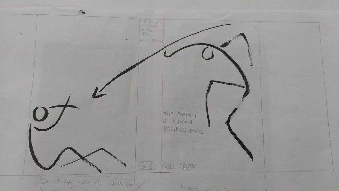
| I'm not sure if the image of the speared bull/ bison works all that well so i tried an expansion of just the two figures, which I actually really like but am not sure will work once the image is actually wrapped around the book. It probably won't. |
 |
| This is intended to reflect the themes of existential frustration in the book, a scream in the same vein as Munch's 'The Scream' or Bacon's depictions of Pope Innocent taken from Velasquez's painting. I probably had the most fun drawing this, only because I did it messily and, in keeping with the themes of the book, aggressively. Whilst it was the most cathartic to draw, I don't feel it has particularly clear relevance to the book. |
 |
| This is probably my least favourite design, partly because it's maybe a little to close to the original cover ideas wise, which also depicted fire (although in a much more abstract way). I toyed with the idea of turning the matches into people as it struck me appear quite figurative but decided in the end i would get bogged down trying too many ideas and it's a relatively short brief. |


No comments:
Post a Comment