Friday, 11 November 2016

Judge a book by its cover - Final outome and thoughts

I was fairly happy with how my book cover turned out in terms of the design and print quality. I feel the texture in the ink drawing was retained nicely despite the image being inverted and printed out and that it felt quite smart and cohesive as a design. However, I did find some issues in that firstly, my book cover was too big to print off in one piece, so I had to fit it together by gluing it together over another piece of paper which didn't work all that well but was the best option I could see in the time available. Secondly, partly due to that first reason, it did not fit terribly well and so became a bit battered through the process of me trying to fit it onto my book. I also accidentally guillotined the top of my cover a little more than I meant to when trimming it down, so the blurb on the back feels a little to close to the top.

Front Cover


Back Cover
Blurb is too close to the top of page.

It looks a little battered and the glue didn't hold it too well at the joins. Printing on cartridge paper gave it a nice, smart quality, but the grain of that paper doesn't hold the ink well when folded so these white marks kept appearing along the folds. 


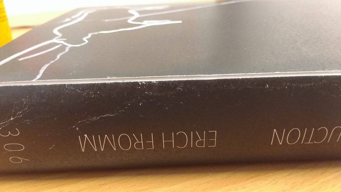
More evidence of 'cracks' in the surface of the ink due to folding. 


No comments:

Post a Comment