Wednesday, 30 November 2016

Messing around with photoshop


I used three ink drawings of a plant as a basis for experimentation in Photoshop. I'm not very proficient at using Photoshop so the results aren't particularly good but I do quite like certain elements of each outcome and it was a useful exercise. I don't feel like I would often use Photoshop to create work, or that it would become integral to my practice, as I don't really like computers and, more importantly, don't ever feel free or inspired to create work when I'm looking at a screen. It seems to sap my energy a little I find the act of physically creating work with more traditional media much more enjoyable and even cathartic. However, I have definitely become aware of the benefits of using Photoshop to edit, enhance or tidy up work after I have made it physically.       


Original Ink Drawing 1

Original Ink Drawing 2

Original Ink Drawing 3

Photoshop Experiment 1

Photoshop Experiment 2

Photoshop Experiment 3

Photoshop Experiment 4

Photoshop Experiment 5

Saturday, 19 November 2016

Shape

Here are some photos of my attempts to represent a banana through drawings made from cut paper. It took me a little while to get past the obvious ideas and start trying to imbue the drawings with some kind of character but once I loosened up and started cutting out more exaggerated shapes less carefully I ended up with some results I was happy with, and one I was really happy with.


Made from some off-cuts left over from 

other drawings.
   
Attempt at a banana skin which somebody might slip on.
My favourite banana drawing. 


Self Portrait, with emphasis on shape and texture

Here is a drawing of myself made up of cut paper with different textures added using mainly black ink. I am pretty happy with the result, although I always think that my face has several distinct, and thus, easy to caricature features which perhaps makes it a lot easier to create a recognisable representation of myself. I sometimes find it difficult to evaluate such exercises therefore, because it seems that as long as the drawing contains glasses, long hair and a moustache, it will prove an adequate depiction. I also wish that, for this particular drawing, I had played around with shape a bit more and tried to see how far I might push or abstract a depiction of my own face, especially given the fact that, as I just mentioned, if I included the key features I think I could have taken it pretty far and it would still have looked like me. 

I did decide to angle my head a little as
I learned that, often as simple a gesture
as that is where the personality can lie
in an image. I thought it was particularly
needed in this instance as I decided to
eyes. 
   

Saturday, 12 November 2016

End of module evaluation


Overall I am pleased with the work I have completed throughout this module; although I still feel like I could have done more with each brief. I find it difficult to condense my ideas down efficiently and the result of that has been that whilst I have produced work in sketchbooks which I have been very happy with, often those ideas, in my opinion, lose something on the way to becoming the final outcomes. For this reason I have not been particularly happy with any of the specific end results, aside from the typology poster- How to make toast. I think this is because when I was creating that final outcome, I remained very loose and relaxed in my approach and settled on a concept I was happy with, with relative ease, during the roughing stage.


I think in the cases of the other briefs I was much more undecided on where I wanted to go with regards to the final outcome and also found that, gradually, the idea of something being a final versioncaused me to work less freely and thus the work lost some of the energy I felt was present in quick sketches and ideas generation in my sketchbooks.

Another factor, which I feel may have impeded my work, has been the two week time limit on creating the work. I feel like I still need to get used to working in short timespans, developing ideas more drastically or radically within that amount of time in order to push it more to a point where Im happy with it, and havent lost momentum by the time Im creating a final outcome. For instance in my editorial brief; the landscape illustration of the girl avoiding cracks in the pavement I was happy with, and felt I had imbued with character, but the scary Mary Poppins, whilst being a drawing I still liked, felt rather stale after drawing it so many times in my sketchbook without actually changing it all that much. The square outcome I really wasnt happy with, it was very much a half- baked idea which, although had potential, didnt come to fruition in the end. I was running out of time and just sort of threw it together.

The editorial project also threw up some practical issues for me in that two of the illustrations I decided to draw twice as big and then scale down so I didnt feel confined when I was drawing them. I didnt realise that one of them was too big to scan in (girl), and I ran out of studio time to scan the other one in (Mary Poppins) so ended up having to take photographs of them and printing them off. 
As a result I felt like I ended up with a bit of a mess of outcomes, in inconsistent sizes and formats, and the whole project, despite fulfilling every requirement of the brief, didnt feel very finished.

I was happier with my book cover, and it was definitely the project that provoked the most thought and consideration in me. I had quite a lot of ideas bouncing around during this brief and only managed to narrow it down right towards the end, but I enjoyed it the most due to some of the concepts I was able to come with as a response. My only issues with my final outcome are ones related to the cover not quite fitting the book and becoming a little dog eared in the process of me wrangling it on. Other than that I was happy with design and execution.


Overall I very much enjoyed this module; the fact that the briefs were only two weeks and occurred consecutively in quick succession was challenging but kept me on my toes, and from getting bored. It was frustrating that I didnt feel I developed my ideas enough sometimes, but I feel I will get better at that with time and am not too worried about it. I also want to try and experiment with more processes as I mainly just worked in ink for this module. 

Friday, 11 November 2016

Judge a book by its cover - Final outome and thoughts

I was fairly happy with how my book cover turned out in terms of the design and print quality. I feel the texture in the ink drawing was retained nicely despite the image being inverted and printed out and that it felt quite smart and cohesive as a design. However, I did find some issues in that firstly, my book cover was too big to print off in one piece, so I had to fit it together by gluing it together over another piece of paper which didn't work all that well but was the best option I could see in the time available. Secondly, partly due to that first reason, it did not fit terribly well and so became a bit battered through the process of me trying to fit it onto my book. I also accidentally guillotined the top of my cover a little more than I meant to when trimming it down, so the blurb on the back feels a little to close to the top.

Front Cover


Back Cover
Blurb is too close to the top of page.

It looks a little battered and the glue didn't hold it too well at the joins. Printing on cartridge paper gave it a nice, smart quality, but the grain of that paper doesn't hold the ink well when folded so these white marks kept appearing along the folds. 


More evidence of 'cracks' in the surface of the ink due to folding. 


Judge a Book by its cover - photoshop stuff/ text layout

I had a mess around on photoshop with some practice images before working on my final cover, coming to the conclusion that inverting the scanned in images so that the 'cave painting' style drawings became white (on black) looked quite striking. I had tried some drawings in earthy colours with acrylic paint beforehand but they didn't look as bold and didn't suit being a book cover as well, despite looking more like authentic cave paintings.


I have decided that the best type layout is the second image down, ultra light with the title in the top left corner and the author's name in the bottom right corner. I feel like this layout is the most well balanced, and allows the image all the space it needs. I also toyed with the idea of using the dead animal image as the front cover but decided in the end that although that image has the potential to work on either the front or back cover, the other image of the two figures only really works for the front. Also, the dead animal image looks quite nice with a blurb above it. So, sort of by process of elimination, I've decided my final cover will have the two figures on the front and the dead animal on the back with a bit of a blurb. The spine I will keep simple, just writing in the same font all over. I decided that using a clean simple font, and the same font for everything was the best decision regarding type as the drawings themselves are quite loose and expressive. 

Tuesday, 8 November 2016

Judge a book by it's cover - final ideas


I have narrowed my ideas from the five roughs to two, both of which I want to try out. The first is a practical, more straightforward idea and the second is very conceptual and 'fine arty' and I'm going to do it mainly because I think it's a bit funny. 


Idea 1

My first idea for a final book cover originates, again, from the ideas of evolution and primitive instincts I talked about in a previous post, but takes perhaps a more literal approach. I will be using neolithic/ cave painting style imagery, depicting two figures (one attacking the other with a spear) on the front cover and a speared wild animal on the back cover (I still need to refine the drawing for that).                                                                                                                                              
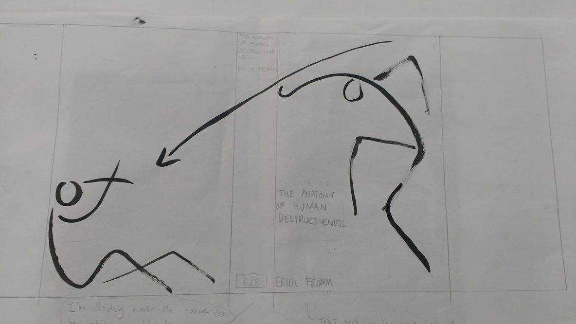
Essentially, this will be the layout of my book jacket, although I will change the drawing of the bull/ bison because it isn't working at the moment. I'm thinking I might take a much more simple route and just draw one on it's back with it's legs in the air.
This layout is one I decided against as it didn't really work once the cover was folded around the book, however, the line quality is much more what I'm after in this image. For the layout pictured above I think the ink I used must have been watered down accidentally or something because I couldn't achieve the scratchy, dry brush marks like I wanted to. But when I did this rough I used ink that did give me that effect.

This was just a quick experiment where I messed around with the very crude photo editing on my phone (what I took the picture on). It's an extreme edit setting called 'lines' and one I would never usually consider using but I do feel it works quite nicely with this image. I still think I prefer the texture and line quality of dry brush though and will probably stick to something in that vein as opposed to this. Still, I do think it works nicely.


Monday, 7 November 2016

Judge a book by it's cover - roughs/ final ideas

I narrowed my ideas down to five roughs, but have been having a bit of trouble deciding which one to pursue for a final outcome as all of them are very different and each have strengths and weaknesses. Because of different they are, I also can't really pick and choose elements of each which worked and combine them either.

I decided to scrap the idea of using ancient Greek themed imagery just before I reached the roughing stage. Despite enjoying drawing the comparisons between themes evident in that imagery which have relevance to my book and the work of illustrator Cleon Peterson (who often deals with violent subject matter), I didn't find a rhythm or excitement in responding to that initial spark of am idea. The few drawings I did playing around with that theme also seemed a rather tenuous connection to the book's subject matter, and I felt there was a risk of creating a cover which just looked like the cover of a book about Greek Mythology or history.


Five Roughs

Here are the five ideas I roughed out.

Inspired by cave paintings, relating to a theme in the book concerning whether modern day human sadism/ cruelty/ aggression has roots in purely primitive survival instincts.

Giving the impression the book cover has itself been destroyed, a little arty- farty perhaps but still an idea I quite a like. My only concern being that it could actually be completely hypocritical in that this approach actually resembles constructing or fixing something destroyed, rather than a truly destructive act.

I'm not sure if the image of the speared bull/ bison works all that well so i tried an expansion of just the two figures, which I actually really like but am not sure will work once the image is actually wrapped around the book. It probably won't.

This is intended to reflect the themes of existential frustration in the book, a scream in the same vein as Munch's 'The Scream' or Bacon's depictions of Pope Innocent taken from Velasquez's painting. I probably had the most fun drawing this, only because I did it messily and, in keeping with the themes of the book, aggressively. Whilst it was the most cathartic to draw, I don't feel it has particularly clear relevance to the book.  

This is probably my least favourite design, partly because it's maybe a little to close to the original cover ideas wise, which also depicted fire (although in a much more abstract way). I toyed with the idea of turning the matches into people as it struck me appear quite figurative but decided in the end i would get bogged down trying too many ideas and it's a relatively short brief. 


Saturday, 5 November 2016

Judge a book by it's cover - More Ideas/ artist influence

There is a lot of debate in 'The anatomy of the human destructiveness' concerning human aggression, and whether man's aggression and violent habits can be attributed to primitive instincts (e.g. hunting) and within that, how far can those instinctual tendencies inform what one would assume emotional decisions/ reactions and sadistic, seemingly calculated cruelty and violence which is enjoyed by it's perpetrator. That is to say, can unprovoked violence and sadism still be said to have evolved from primitive intuitions motivated purely by the need to survive? 

Erich Fromm suggests that in fact, the development of intelligent thought in humans has caused subsequent development in the factors considered necessary for survival, posing that it is "reductionist" to assume man's instincts are qualified through purely physiological requirements, but rather that instinctual drives are necessitated by the need of the "whole organism" to survive, promoting both physical and mental/ psychological growth. He goes on to say that mental drives, as well as the physical ones, lie at the core of what it is to be human, quoting Von Hollenbach (the philosopher of the French Enlightenment) - "A man without passions ceases to be a man" and stating that these passions express man's desire to "transform his state of being unfinished into one with some goal and some purpose." 

In this sense, both the "good and evil" passions can be seen as a "person's attempt to make sense of life." This idea I was drawn to, especially his further description of this concept - "Even the most sadistic man is human, as human as the saint. He can be called a warped and sick man who has failed to achieve a better answer to the challenge of being born human, and this is true; he can also be called a man who took the wrong way in search of his salvation." 


I was inspired by this idea to create something which might express this inner conflict or existential crisis as one of my cover ideas for the book. I intended to use quite aggressive drawing techniques and naive imagery to capture the frustration that is inherent to human existence and decided that portraying a screaming face would perhaps be the simplest and most expressive way of representing this concept, in the same vein as Francis Bacon's 'Study after Velázquez's Portrait of Pope Innocent X' or Edvard Munch's 'The Scream'. 


Artworks pertaining to this idea

'The Scream - Edvard Munch

Self Portrait - Annagret Soltau

 Study after Velázquez's Portrait of Pope Innocent X - Francis Bacon
Pie Fight Interior 2 - Adrian Ghenie


Pie Fight Interior 8 - Adrian Ghenie
I am a little worried there is a risk my outcome might become too derivative, or that I won't be able to replicate the same level of emotional impact as is evident in these influences (highly probable). I also feel like it might be a little bit of a lazy route, ideas-wise. 

I have just also thought about developing the idea from a screaming face into a person ripping their face into two halves (still drawn in a similar fashion) but haven't tried that out yet. I may face the same issues I suppose.              

Thursday, 3 November 2016

Illuminations - Final Outcomes

All in all I wasn't particularly happy with my final outcomes for the 'illuminations' brief. I got very bogged down with the development stage and ended up rushing to finish as I had to go home at the weekend before it was due in. The upshot of that was that although I did complete three finished illustrations, the 200mm by 200mm one wasn't thought out in much depth and was fairly weak I feel, and the other two I completed to twice the dimensions and didn't have time to scan them in to shrink them. I ended up photographing them at home and printing off the photographs which meant I had the actual illustrations twice as big as they should have been and then the images in the correct dimensions but not very good quality images. I also did not like the fact that what I ended up with was a load of inconsistencies; a mixture of images to big, actual original work, smaller printed off images all lumped together. 
This illustration I really wasn't happy with, it was rushed so the composition was not properly considered and I don't think it's clear that they are supposed to be toy soldiers. 


I really like the line work in this drawing and was pleased with how simple and expressive I managed to make the little girl, however, in the photo I used to make the image the right size the contrast is nowhere near as distinct as I would have liked and I managed to tinker with that a little in photoshop but didn't have the time to fully solve the problem.  


I actually really liked my scary Mary Poppins idea but feel like the final version didn't feel particularly final. It didn't differ too much from my initial drawings really and I would have liked to edit the photo a little to get the lighting a little more dramatic because i feel like as it is there isn't very much depth to the image.