
My attempt at screen printing was mostly successful, and it does support pencil textures fairly well, I just don't think the design I came up with made screen printing a necessary way of rendering it. This meant I was fairly underwhelmed by the result as the screen printing process didn't add anything to it. I also decided that screen printing isn't something which agrees with my way of working. I tend to do my best work spontaneously so the planning and preparation needed for screen printing mean I lose the creative flow.

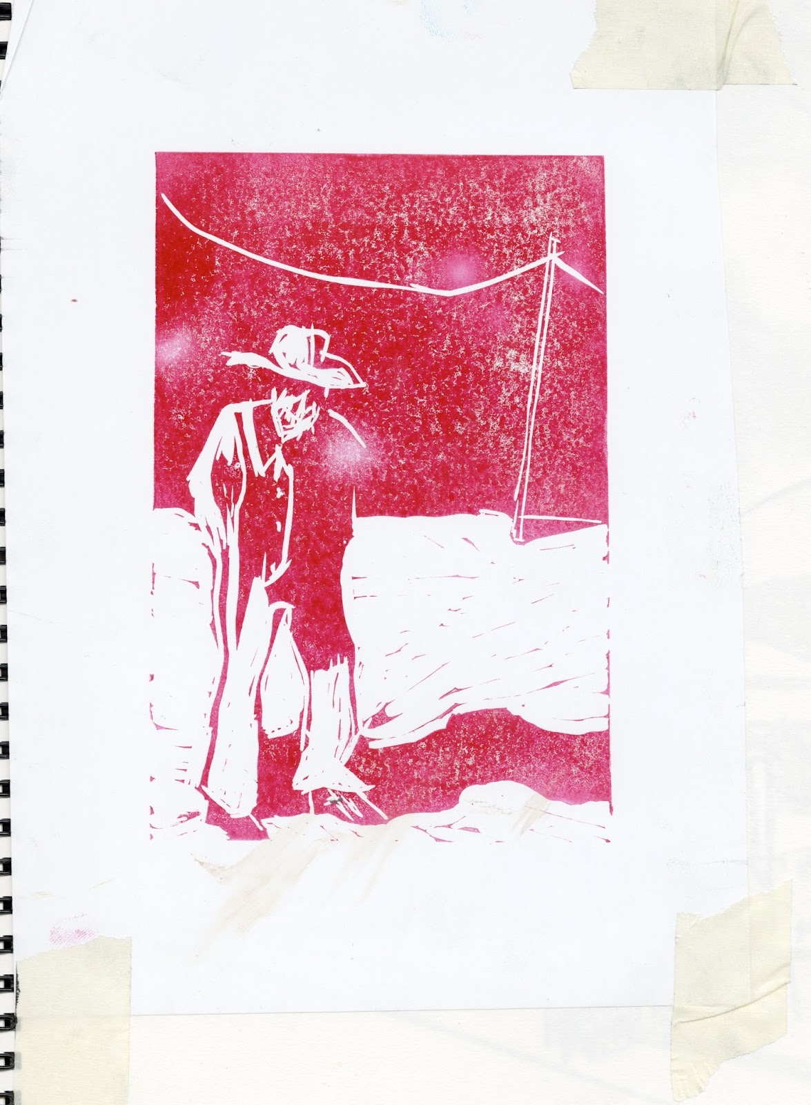
I did quite like the results I achieved from linocut (although I put the second one in the wrong press and it cracked) but I still didn't think they fully captured the mood of McCarthy's work, and I'd get bored of the lengthy cutting process.
I finally hit my stride with monoprinting, not planning images, just printing textures and spur of the moment drawings, and resolved to use those in some way. I found it a much more natural process to just start cutting up the monoprints and work back into them without thinking using drawn and collaged elements. I mainly used 'No Country For Old Men' as inspiration, as well as quintessentially American photography, such as Robert Frank, Wim Wenders and Gregory Crewdson. Before I knew it, I had amassed quite a large amount of images and decided I would make a digitally printed, landscape A4 book of them for my final outcome. I used some quotes to fill up space on pages where the images were portrait.
Unfortunately it turned out I couldn't print a landscape book at A4 size, so I had to print it at A5, and the images really lost something in their downsizing. There also wasn't a great choice of paper available for double sided printing and I didn't end up with what I ideally wanted.
I also didn't do a very good job of putting the book together, so I ended up with wonky pages and an overall quite unprofessional finish. However, as a last ditch attempt to get something I was properly happy with, I decided to just choose my five favourite pages from the book and make A3 digital prints of them and these turned out really great. I also chose a much nicer stock to print them on and put them in cellophane sleeves. They feel generally much more like nice, precious objects than the book does.
No comments:
Post a Comment