The methods
of working I explored over the course of this module were very different (at
least practically speaking) to the work I had been making previously, and also
developed steadily over the course of the module. I think the fact that I was
really interested in Cormac McCarthy’s work, and enjoyed reading it so much, is
what pushed me to think so hard about how I should best represent it artistically.
It was really satisfying having my understanding of his work influence my
work’s physical development in an almost subconscious, natural way, so that as
I progressed I didn’t feel I had to justify what I was doing to myself. It
became an axiomatic process.
Despite
initially being enthusiastic about trying all the different print methods, I
quickly found that not many of them suit the spontaneous way I like to work.
Screen printing is difficult for me to get along with. If I have to think
overly about how an image will be put together, and spend a lot of time in
preparation, I start to get bored of it and the results always underwhelm me.
Although the screen printed image I ended up with is not necessarily bad, it
just didn’t feel like the design warranted the process, and it seemed a little
lifeless.
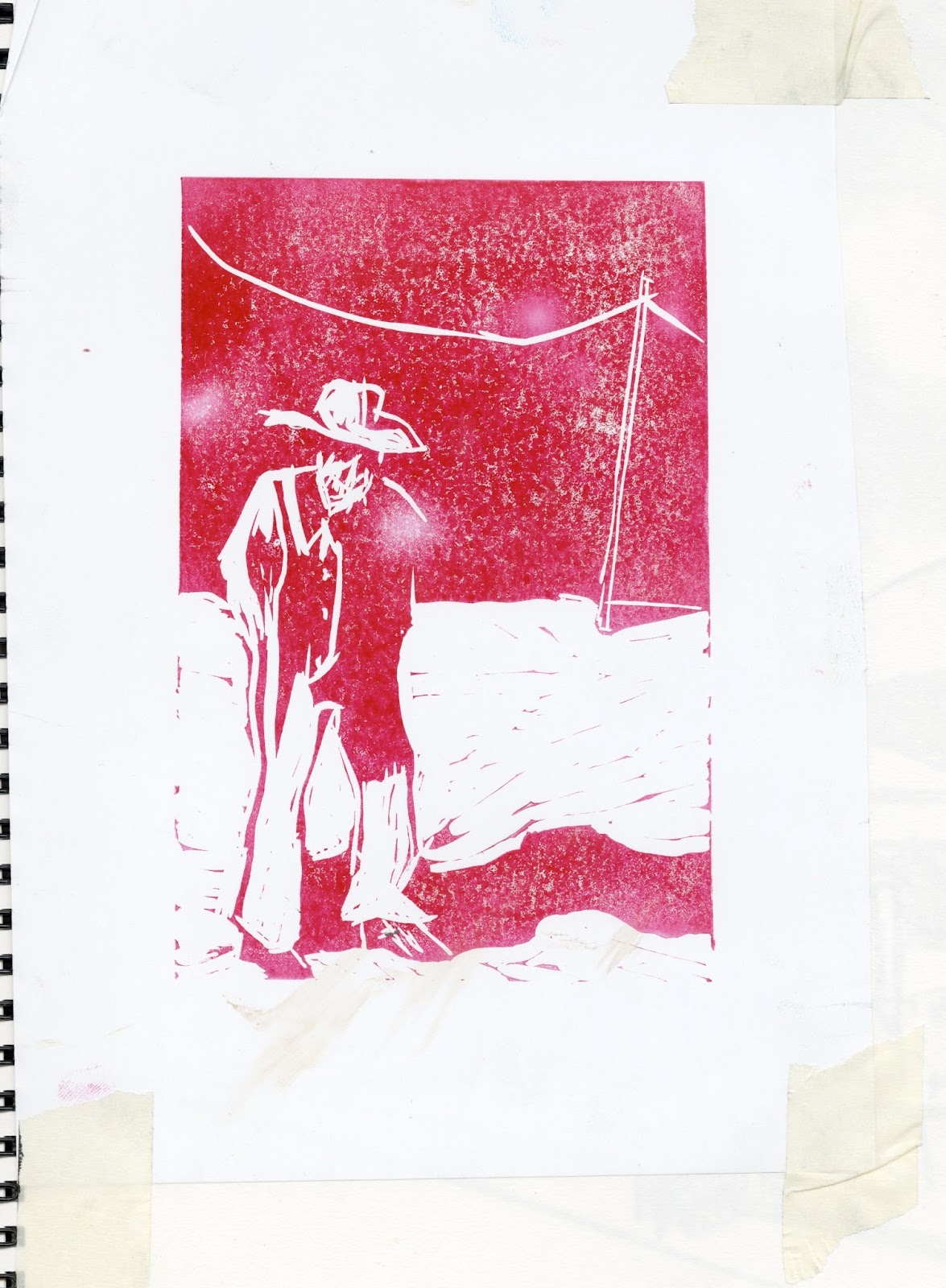
I would like
to try linocut more in the future because I liked how my lino prints turned
out, I just didn’t do a lot because I didn’t feel like it suited the mood I was
trying to achieve in this module. I definitely want to keep experimenting with
the combination of monoprint, collage and drawn elements that made up my final
pieces of work, as this is not something I have tried before and I was really
happy with what I ended up with. Working this way gave me a lot of freedom, in
that I could just spread a bunch of stuff out on the table in front of me and
create lots of images in a very instinctual way, without the aesthetic
stagnating. Being able to work back into things with different media is also
something I have fun with.
I didn’t
particularly enjoy the process of animating the sting (I don’t like working on
computers and yet always seem to end up having to spend a huge amount of time
on them) as the process of creating what I thought was a simple effect turned
out to be very fiddly and confusing, requiring a great deal of faffing around
in Photoshop. I was, however, very pleased with the result. I also hugely
enjoyed having the opportunity to make some music. Having an alternative
creative outlet helped me stay motivated and interested in the work I was doing
and I think holistically it proved a success.
I don’t feel
I encountered too many problems on this module. They mainly occurred in
relation to the book. It was a shame I couldn’t print it as I intended it to
be, short edge bound A4 landscape, as the size it ended up really didn’t do the
images justice. I also hate having to do things like measuring and cropping, so
I made a bit of a hash of that and in the end, I wasn’t too happy with it.
These problems did, however, inspire me to produce the A3 prints, just on a
whim, and they were much more of a success. The large size meant all the
textural details in the images were heightened and the colours came out great.
I will
definitely be taking a lot of the practical techniques I picked up on this
module forward, although I do wish I had spent more time in the print room,
particularly experimenting with monoprint and, despite not particularly
enjoying it, I would like to give screen printing another go. This is purely
because it gives you the option to make lots of copies of your work very easily
and cheaply, which I unfortunately couldn’t do working the way I did.


