I decided on choosing to pursue two live briefs for this half of the module, the 'Hookworms' Brudenell Social Club gig poster, and the 'Penguin Student Design Competition' with a view to keeping myself engaged with my work through having two very different avenues I would have to follow. Whilst this was true at first, the 'Hookworms' brief actually had a much sooner deadline than the 'Penguin' competition did and I did eventually find myself losing steam whilst working on that one.
I thought the best way of responding to the 'Hookworms' brief would be to simply listen to their music and create an intuitive reaction to it which would hopefully mean that what I came up with would be quite different to the artwork they already have. I did enjoy the initial freedom this way of working presented, a poster for a gig can be pretty much anything, they rarely seem to correlate directly to the band in my experience, they just have to be visually strong. As a result I just started playing around until I had some imagery that I liked.
What I really struggled with, was then having to incorporate all the text required for the poster, which I had not considered at all due to the spontaneous way I'd been working up until that point. My first few attempts at fitting the type into my illustrations were terrible and put me off working on the brief for a while because I became so bored with shunting stuff around on Photoshop. I think the next time I'm working with type I should try and hand draw it into my original artwork before scanning it in and then both facets of the image would evolve in conjunction without one lagging behind and subsequently holding the other back. In the end I was actually very happy with the two designs I came up with, but I used a very different approach to type in each, one had the type very much separate to the image but sat comfortably within the composition so as to not take away from it, and the other involved the type being integrated with the imagery much more. I think both worked pretty well so I still don't feel that confident about how type may fit best into my practice in the future, but I do at least know I can try different things out.
With regards to my 'Animal Farm' book cover, I developed the ideas much more over a longer period of time. Working on two briefs at once did help me refresh my ideas for each when I worked on the other, and my 'Animal Farm' cover was particularly helped by that. I started out trying to come up with visual metaphors and doing clever things with Soviet symbolism, but after spending some time away on the 'Hookworms' brief, I returned with the realisation that my work isn't as well suited to that and managed to simplify my idea down to much more stronger visualisations of the themes within the book. I am also glad I managed to avoid using drawings of pigs. I do think I ended up rushing a bit at the end, and whilst my final submission was, in my opinion, a strong image which made an aesthetically pleasing book cover, I don't think it was quite interesting enough and if I had spent some more time playing around with my final few ideas I could have come up with something in a similar vein but more powerful.
Overall, I am fairly happy with the work I ended up with for this project, and did enjoy working on it a fair amount, mainly because I kept the work very diverse so I didn't really get bored, and I managed to incorporate some painting into the process, which I had been wanting to do. I do still struggle with time management though, and definitely see how I could have developed my work much further in the time I had (particularly with regards to 'Animal Farm') with surprising specificity.
Wednesday, 9 May 2018
Studio Brief 2: Individual Practice
For my Applied Illustration brief I chose the 'Packaging and Retail' and retail specialist area, focusing on the 'Secret 7' live brief, but also including some related bit and pieces, such as another internal LAU live brief, '27 Club' and some album artwork for my friends' band. I usually struggle with or don't even consider how my work might be 'applied' to different contexts so this module had the potential to be a challenging one for me and I'm slightly annoyed I didn't decide to do something which would have pushed me further out of my comfort zone.
This is namely because, I actually think that album art is probably one of the least restrictive forms illustration can take. The only requirement really is that whatever one creates needs to be square. This meant that I didn't really have to alter my thinking processes or adapt what I usually do all that much, and as a result I think I definitely became a little complacent around halfway through the project and maybe didn't take full advantage of it's educational purposes. Having said that, I did enjoy the freedom this brief presented and can't see my practice ever evolving into one in which I work according to a preconceived purpose anyway. I did also manage to slip in a bit of painting and incorporate it into the way of working I carried over from 503 which was something I wanted to do.
I had never attempted any album art prior to this and it had been something I wanted to have a go at as music is such big interest of mine and I don't ever really respond to it artistically. In this sense 'Secret 7' was quite rewarding, because it is so open I definitely had fun when I started work on it, particularly as I chose a track which I wasn't that well acquainted with prior so could fully absorb it without any prejudices and without getting bored. However, it actually turned out not to be the best channel through which to explore album art for me personally, as a lot of the elements I was interested in weren't actually relevant to the brief.
For instance, I was hoping to force myself into becoming more confident using type in my work, and gaining a greater understanding of how to incorporate it, but 'Secret 7' requires that you don't use any type on your designs. I was also quite interested in designing a back cover and inside cover art (for an LP) but, again, 'Secret 7' doesn't require those. I was initially planning on using my friends' bands album to try out all these things and although I did manage to play around with type a little, in the end time just got away from me. Because I didn't really map out specific enough aims for myself, considering the restrictions and requirements of the main chunk of this body of work weren't reflective of what I really wanted to learn, I felt I cheated myself somewhat. My work for the '27 Club' brief also felt a little redundant, despite liking some of the drawing I did for it. I didn't really put much thought into it and I think it shows, which is a pity because I am a huge Robert Johnson fan and I think I could have made much more use of my interest in his music given this opportunity.
Overall I think that I squandered a lot of the opportunities and experience this project offered me due to relying too much on the parameters or lack thereof imposed on me by the briefs and by myself. At level 6, I want to take forward the fact my work should be made somewhat for the sake of itself before anything else, but not to let that stop me pushing myself to pursue the things I want to learn about, or using the fact my work isn't really application led as an excuse.
Study Task: Industry Research
I found it quite difficult researching album art as an industry, mainly because it seems to me that there aren't too many considerations which have to made. the only requirement really is that whatever the artist comes up with has to be square. This is in fact part of the appeal to me, as I typically make work without too much consideration of how it will be applied to a specific context. The only other particularly important consideration would be the use of type, which is something I did want to work on in my own work, but even then there are so many approaches one could take with regards to that and no restraints upon the use of type imposed by the industry.
Partly as a result of this, and also partly as a result of the fact that at any given time there is a huge amount of music with inherent differences, there also doesn't ever seem to be trends in album art massively. The only trends evidenced tend to be genre specific trends, and even then they don't seem that prominent.
I suppose the only other type of industry research that would have been worth looking into would have been more of a materials/ assembly line process focus, but that type of stuff is probably unlikely to ever be all that relevant to me as an illustrator, unless I'm dealing with a vinyl cover which will be made out of a specific and/or unusual surface which would affect how a potential design will work being printed on it (e.g. glow in the dark, clear etc.)
My research then mainly consisted of gathering together album art which I particularly liked and simply thinking about why I liked it. Even then, there were lots of differences, and all it usually boiled down to was whether or not I liked the design as purely an image in its own right or if I thought it captured the music on the album particularly well, which seemed like fairly obvious indicators.
Goals For 504
Throughout 503 I developed a way of working which involved mixing media together to form imagery, namely mono print, photos and found imagery, and pencil/pencil crayon. I found the results of this process to be largely successful. I also enjoyed the fact that collaging all these elements together almost randomly (once I had accumulated a large amount of material as resources) kept my options for each piece of work open whilst keeping the tone of voice consistent. I was also able to create quite complex seeming images physically without having to use photoshop too much. I intended to continue working in this vein throughout 504.
As a way of keeping myself from becoming bored with that way of working, however, I also wanted to try and paint some more, or at least start trying to incorporate paint or other media into this process as a new challenge. I also wanted to keep taking on briefs which involved type as I am not yet very confident incorporating type into my work and always struggle with how to do it.
By May, I wanted to have expanded my practice into areas I hadn't previously explored; applications such as album art or posters and events, or at least begun to develop an understanding of how my work might sit in these contexts. I also wanted to have created some really big work, like canvas paintings etc.
Wednesday, 17 January 2018
Summative Project Report
The methods
of working I explored over the course of this module were very different (at
least practically speaking) to the work I had been making previously, and also
developed steadily over the course of the module. I think the fact that I was
really interested in Cormac McCarthy’s work, and enjoyed reading it so much, is
what pushed me to think so hard about how I should best represent it artistically.
It was really satisfying having my understanding of his work influence my
work’s physical development in an almost subconscious, natural way, so that as
I progressed I didn’t feel I had to justify what I was doing to myself. It
became an axiomatic process.
Despite
initially being enthusiastic about trying all the different print methods, I
quickly found that not many of them suit the spontaneous way I like to work.
Screen printing is difficult for me to get along with. If I have to think
overly about how an image will be put together, and spend a lot of time in
preparation, I start to get bored of it and the results always underwhelm me.
Although the screen printed image I ended up with is not necessarily bad, it
just didn’t feel like the design warranted the process, and it seemed a little
lifeless.
I would like
to try linocut more in the future because I liked how my lino prints turned
out, I just didn’t do a lot because I didn’t feel like it suited the mood I was
trying to achieve in this module. I definitely want to keep experimenting with
the combination of monoprint, collage and drawn elements that made up my final
pieces of work, as this is not something I have tried before and I was really
happy with what I ended up with. Working this way gave me a lot of freedom, in
that I could just spread a bunch of stuff out on the table in front of me and
create lots of images in a very instinctual way, without the aesthetic
stagnating. Being able to work back into things with different media is also
something I have fun with.
I didn’t
particularly enjoy the process of animating the sting (I don’t like working on
computers and yet always seem to end up having to spend a huge amount of time
on them) as the process of creating what I thought was a simple effect turned
out to be very fiddly and confusing, requiring a great deal of faffing around
in Photoshop. I was, however, very pleased with the result. I also hugely
enjoyed having the opportunity to make some music. Having an alternative
creative outlet helped me stay motivated and interested in the work I was doing
and I think holistically it proved a success.
I don’t feel
I encountered too many problems on this module. They mainly occurred in
relation to the book. It was a shame I couldn’t print it as I intended it to
be, short edge bound A4 landscape, as the size it ended up really didn’t do the
images justice. I also hate having to do things like measuring and cropping, so
I made a bit of a hash of that and in the end, I wasn’t too happy with it.
These problems did, however, inspire me to produce the A3 prints, just on a
whim, and they were much more of a success. The large size meant all the
textural details in the images were heightened and the colours came out great.
I will
definitely be taking a lot of the practical techniques I picked up on this
module forward, although I do wish I had spent more time in the print room,
particularly experimenting with monoprint and, despite not particularly
enjoying it, I would like to give screen printing another go. This is purely
because it gives you the option to make lots of copies of your work very easily
and cheaply, which I unfortunately couldn’t do working the way I did.
Printed Pictures - Reflective Report
I don't typically work with analogue print mediums so at the beginning of this brief I was looking forward to trying them all out, if a little apprehensive. My initial thoughts were that, coming off the back of the success I had with the sketchy pencil imagery I used for the editorial brief, I should probably focus on monoprinting. I deemed this the best way of achieving a similar aesthetic. I did briefly consider using linocut to produce images inspired by native American imagery (a theme McCarthy tackles in 'Blood Meridian') but quickly discarded this idea as I couldn't imbue my drawings inspired by this with the right tone of voice.

My attempt at screen printing was mostly successful, and it does support pencil textures fairly well, I just don't think the design I came up with made screen printing a necessary way of rendering it. This meant I was fairly underwhelmed by the result as the screen printing process didn't add anything to it. I also decided that screen printing isn't something which agrees with my way of working. I tend to do my best work spontaneously so the planning and preparation needed for screen printing mean I lose the creative flow.
I did quite like the results I achieved from linocut (although I put the second one in the wrong press and it cracked) but I still didn't think they fully captured the mood of McCarthy's work, and I'd get bored of the lengthy cutting process.
I finally hit my stride with monoprinting, not planning images, just printing textures and spur of the moment drawings, and resolved to use those in some way. I found it a much more natural process to just start cutting up the monoprints and work back into them without thinking using drawn and collaged elements. I mainly used 'No Country For Old Men' as inspiration, as well as quintessentially American photography, such as Robert Frank, Wim Wenders and Gregory Crewdson. Before I knew it, I had amassed quite a large amount of images and decided I would make a digitally printed, landscape A4 book of them for my final outcome. I used some quotes to fill up space on pages where the images were portrait.
Unfortunately it turned out I couldn't print a landscape book at A4 size, so I had to print it at A5, and the images really lost something in their downsizing. There also wasn't a great choice of paper available for double sided printing and I didn't end up with what I ideally wanted.
I also didn't do a very good job of putting the book together, so I ended up with wonky pages and an overall quite unprofessional finish. However, as a last ditch attempt to get something I was properly happy with, I decided to just choose my five favourite pages from the book and make A3 digital prints of them and these turned out really great. I also chose a much nicer stock to print them on and put them in cellophane sleeves. They feel generally much more like nice, precious objects than the book does.

My attempt at screen printing was mostly successful, and it does support pencil textures fairly well, I just don't think the design I came up with made screen printing a necessary way of rendering it. This meant I was fairly underwhelmed by the result as the screen printing process didn't add anything to it. I also decided that screen printing isn't something which agrees with my way of working. I tend to do my best work spontaneously so the planning and preparation needed for screen printing mean I lose the creative flow.
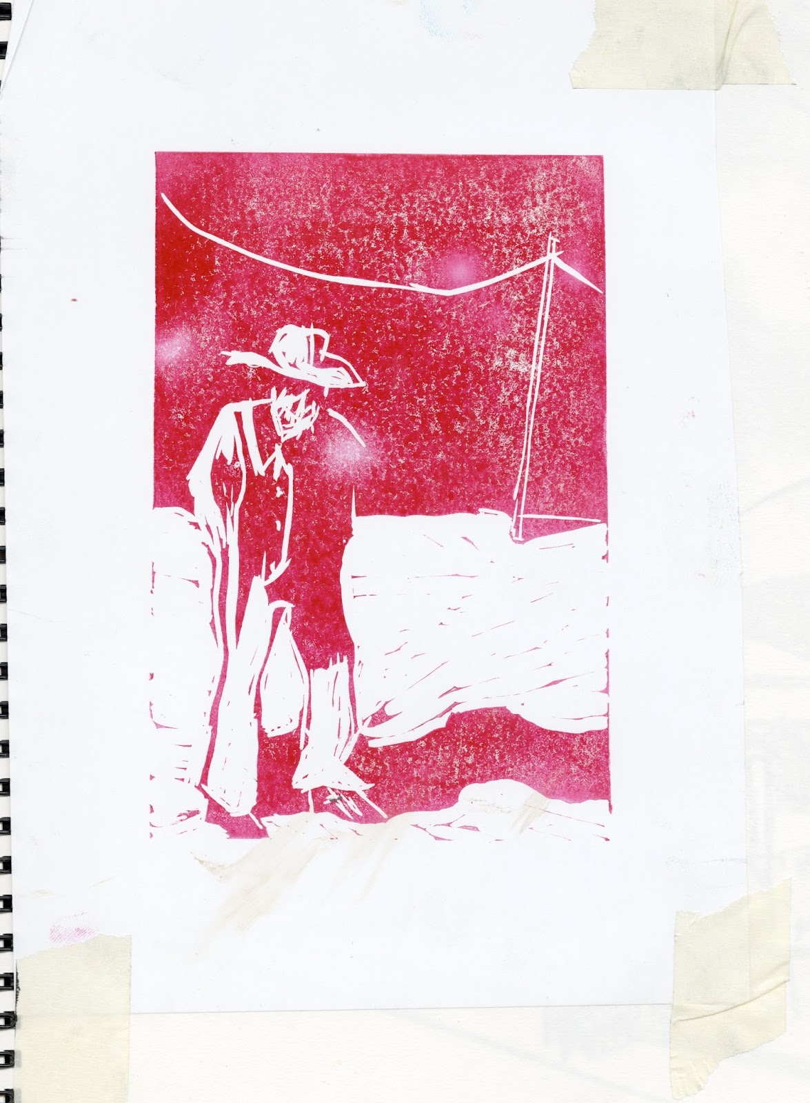

I did quite like the results I achieved from linocut (although I put the second one in the wrong press and it cracked) but I still didn't think they fully captured the mood of McCarthy's work, and I'd get bored of the lengthy cutting process.
I finally hit my stride with monoprinting, not planning images, just printing textures and spur of the moment drawings, and resolved to use those in some way. I found it a much more natural process to just start cutting up the monoprints and work back into them without thinking using drawn and collaged elements. I mainly used 'No Country For Old Men' as inspiration, as well as quintessentially American photography, such as Robert Frank, Wim Wenders and Gregory Crewdson. Before I knew it, I had amassed quite a large amount of images and decided I would make a digitally printed, landscape A4 book of them for my final outcome. I used some quotes to fill up space on pages where the images were portrait.
Unfortunately it turned out I couldn't print a landscape book at A4 size, so I had to print it at A5, and the images really lost something in their downsizing. There also wasn't a great choice of paper available for double sided printing and I didn't end up with what I ideally wanted.
I also didn't do a very good job of putting the book together, so I ended up with wonky pages and an overall quite unprofessional finish. However, as a last ditch attempt to get something I was properly happy with, I decided to just choose my five favourite pages from the book and make A3 digital prints of them and these turned out really great. I also chose a much nicer stock to print them on and put them in cellophane sleeves. They feel generally much more like nice, precious objects than the book does.
Idea Pictures - Reflective Report
I began work on this brief with thumbnails largely based on McCarthy's novel 'Blood meridian', as this book was the one I had read most recently and subsequently freshest on my mind. I became very involved with researching theories behind it and symbolism in it etc. but actually, which wasn't really an appropriate way of working in response to an editorial brief about the author himself. I tried too hard, initially, to create visual metaphors which I could relate very clearly to his writing in my own head, specifically 'Blood Meridian', but which wouldn't have seemed as relevant to other people and didn't create particularly strong images. This is why my initial thumbnails didn't end up having much bearing on my final outcomes.
For my square illustration I decided on a portrait of Cormac McCarthy, which I initially thought was a boring idea. In the end, however, the way I drew this image, and the colours I used were conducive to an appropriate tone of voice. I was initially intending to layer up the pencil sketch over a painted, red pattern background, but that was too overpowering so I had to play around in Photoshop using the different blending presets. I took this approach for all my finals.
Landscape Illustration
For my landscape illustration I decided on this drawing of a dead horse, it seemed appropriate owing to McCarthy's tendency to write about death and horses. This is my favourite of the three, and I was originally going to finish the drawing off but ended up liking the unfinished version a lot so never bothered. I particularly like how the red areas in this image make a suggestion of the horse's viscera without being too gratuitous or literal.
Cowboys (Portrait Illustration)
Finals
I decided on the first image from each of these slides, on the basis that it's not so off white that it is too obviously trying to look old.
Overall I am very happy with my outcomes for this brief and enjoyed working on it. The use of largely analogue media reflects McCarthy's rough and unrefined view of the world and the colour red enabled me to hint at the violent nature of his writing without having to literally depict it (which may have seemed clumsy). My biggest regret is the fact that I think all these images would have worked better as vignettes, particularly in terms of how they would be embedded onto a page with an editorial article.
After trying to force ideas into visual forms that couldn't really accommodate them, I came to the conclusion that visual metaphors weren't the right approach for me. I found that once I relaxed into making work which I wasn't trying to connect to McCarthy's writing too literally, the images I created were stronger and reading his work at the same time was influencing them, just more subconsciously. This more holistic approach works much better for me, as I usually create my best work spontaneously. It meant that my final images were imbued with a McCarthy-esque atmosphere in a subtle and more general way which seemed to me to answer to the brief more adequately.
Square Illustration
Square Illustration
For my square illustration I decided on a portrait of Cormac McCarthy, which I initially thought was a boring idea. In the end, however, the way I drew this image, and the colours I used were conducive to an appropriate tone of voice. I was initially intending to layer up the pencil sketch over a painted, red pattern background, but that was too overpowering so I had to play around in Photoshop using the different blending presets. I took this approach for all my finals.
Landscape Illustration
For my landscape illustration I decided on this drawing of a dead horse, it seemed appropriate owing to McCarthy's tendency to write about death and horses. This is my favourite of the three, and I was originally going to finish the drawing off but ended up liking the unfinished version a lot so never bothered. I particularly like how the red areas in this image make a suggestion of the horse's viscera without being too gratuitous or literal.
Cowboys (Portrait Illustration)
Finals
I decided on the first image from each of these slides, on the basis that it's not so off white that it is too obviously trying to look old.
Overall I am very happy with my outcomes for this brief and enjoyed working on it. The use of largely analogue media reflects McCarthy's rough and unrefined view of the world and the colour red enabled me to hint at the violent nature of his writing without having to literally depict it (which may have seemed clumsy). My biggest regret is the fact that I think all these images would have worked better as vignettes, particularly in terms of how they would be embedded onto a page with an editorial article.
Moving Pictures - Reflective Report
Cormac McCarthy Sting from Alex Brown on Vimeo.
My initial idea for the sting was to use the picture of the dead horse from the 'idea pictures' brief, having it slowly decay into the ground. But, after realising that I couldn't use After effects for stop motion style animation very effectively, I changed my idea completely to one which was based on my 'printed pictures' work and which I could animate using keyframes. I intended to use my image of the two characters sat at the table and have the sheriff remove his hat from his head and lower his head down in a solemn gesture, then have the woman put her head in her hands. I would match up the musical soundtrack with each of their movements, a single chord for each one.
However, I started to think I'd probably find that quite complicated to animate, as I'm not very confident with After Effects, and also that I required something much more subtle to convey the mood I wanted to. There would probably have been a risk of it ending up a little too Terry Gilliam-esque, which wasn't a style that would have been complimentary to the subject matter.
I decided that the more subtle I made the animation, the more it would emphasise the eerie atmosphere and compositionally sparse quality of my 'printed pictures' images. I actually ended up using a sort of slightly warping zoom effect, akin to the famous dolly zoom effect used by Alfred Hitchcock in 'Vertigo' or Martin Scorsese in 'Goodfellas', more of a cinematic camera trick than an animation really, but I was really happy with the result. I achieved the effect by separating out an image into several layers and using keyframes to adjust the scale and position of each layer in opposition to each other. It worked very well in communicating an oppressive and uncanny atmosphere. I also added a sort of shimmering effect to certain layers in each scene which worked rather well. I had already made the soundtrack by this point (an airy, minimal piece of Americana style music using guitar and harmonica) so I adjusted the pacing of the animation to that and overall they worked really well together.
Despite thinking what I had made was perhaps too subtle at times, once I added the music it was very much brought to life. In fact, now I think one of the few things I would change about it would be making the movement in the second and third scene even more subtle, more like the first scene. I have also noticed that the fade out begins whilst movement is still occurring between the second and third scene, but in the first scene movement stops before. I also think I could have incorporated the name in a more interesting way, but overall I am very happy with how this turned out, and making the music gave me a refreshing opportunity to indulge in something, other than art, which I massively enjoy.
Printed Pictures Finals
Final Book and Prints.
In the end I could only print the book A5, so I decided to do 5 digital prints of my favourites at A3 size so I had some big versions of them as well.
Images selected for 5 Prints


Book


In the end I could only print the book A5, so I decided to do 5 digital prints of my favourites at A3 size so I had some big versions of them as well.
Images selected for 5 Prints


Book


Tuesday, 16 January 2018


Sunday, 14 January 2018
Study Task 6 - Presentation
'Ding Dong Circus and other stories, 1967 - 1974'
Sasaki Maki (Edited and translated by Ryan Holmberg)
Published by 'Breakdown Press'

This is a 256 page paper back graphic novel containing a collection of Maki's work and an introductory essay by him. The comics themselves are printed in one colour onto the stock, a sort of dark purple/blue. The stock itself is fairly unremarkable, it just seems like good quality, standard book paper, perhaps a little thicker (I couldn't find out the gsm). The same purple blue is used along with a really nice bright orange on the cover. The title is in Japanese but a white belly band covers that up. It is very nicely put together and pleasing to the eye. I might consider using a belly band on my book (although I'm not sure about how as mine will be landscape), but probably will use slightly thicker paper for the pages. The most unusual aspect of the books design is the fact that the essay is printed on much lighter weight (almost newsprint) pale blue stock, but this sets it apart from the rest of the book nicely.
'UNMATTER'
Dominic Kesterton

This is a 20 page, risograph printed comic which benefits from very unfussy presentation. It has a bold blue cover and the content is black and white on quite nice thick paper. Despite how simplistically and cheaply it is put together it remains very tasteful and slick and still manages to feel like a nice object.
Subscribe to:
Posts (Atom)