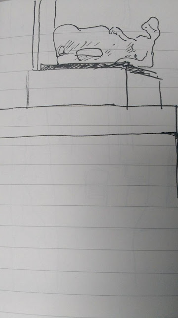
Leeds University Building
I feel some of these drawings worked really well and I definitely became aware of the benefits of observational drawing through completing them, in particular the notion that it helps one visualize how a certain environment or physical position you had not previously considered actually looks, as is the case for my study of Matt drawing with his legs crossed ('Henry Moore Institute- Prosthetic Limb Exhibition and Study of Two Other People') which is one of my favourites from the set. There is also a certain urgency in the observational drawing of people due to the fact that one has no control over how long they may stay in any one position. One is forced to capture only what seems important in that instant, resulting in drawings which are much more intuitive in their physicality and yet were the result of a very focused thought process.
This next set of drawings are consecutive repeats of the same image, completed from a reference photograph. The exercise involved studying the photograph for a brief period, drawing it from memory and then repeating that process so that with each new drawing one's memory of the image has been strengthened.
The drawings did improve after each look at the photograph which did not surprise me, however it was interesting to see how certain elements changed through these stages, in particular the face and facial expression and i do believe that the last drawing I did was the most characterful and the strongest, despite feeling that some of the proportions were better at earlier stages.
After this process I completed another two drawings, again from a reference photograph, but this time with it in front of me so I did not have to memorise it.
I find it very interesting how the these two drawings differ so greatly from the first set stylistically. They have a much looser, cruder feel despite the fact that the image was available for me to look at as reference the whole time. I think that (for me anyway) when drawing from memory the mind becomes preoccupied with getting the image correct due to the lack of information available and as a result, the drawings are a lot more deliberate and precise because of this subconsciously occurring creative restriction. Once I have the reference material in front of me, I know I will not get the actual content of the image wrong in my drawing so I probably feel a lot more relaxed and thus my drawing becomes much more self interpreted.
The final set of drawings documented in this blog are all observational drawings of a plant I had brought into the studio. With each drawing I attempted a slightly different approach in order to find the best way of representing the plant and the results are accordingly mixed stylistically, some much looser, some more careful and accurate etc.
I was happy with some of these drawings but cannot find a pattern to the certain styles which I feel worked best as my favourite ones are a mixture of careful drawings with a fine line quality and darker, looser ones using heavier brush strokes. The plant itself was fairly hard to draw and i had to find certain brush/pen strokes I could repeat in order to represent the leaves. I found scratchy, scrawled markings the best when using a dipping pen, and more slack, unanchored markings worked well when using a thicker brush. In particular, I enjoyed the inconsistency in tone which could be achieved through the use of a brush as it leaves some of the brush strokes visible, thus creating, in my opinion, a more animated drawing.
The following three drawings are examples of other students' work I found particularly effective.
In this study I feel the use of negative space has worked very well despite this particular plants shape being very dense. The more intricate parts of the drawing contrast quite dramatically with the majority if it's composition ultimately creating a very convincing drawing.
This drawing is an example of what I mentioned earlier in terms of inconsistencies in the tone and density of the ink. I really like the slight smudges and imperfections and the way in which some darker brush strokes have been used very sparingly to pick out certain areas in the foliage, which is predominantly very delicate and faint.
This last drawing is very simplistic in the application of line but as a result of it's conservative nature I feel it appears rather elegant. I also like the composition and feel it sits well with the clean reserved character.
|


No comments:
Post a Comment