Thursday, 27 October 2016

Illumination - Editorial Brief

The paradox of play: Real fun should be terrifying

It has taken me quite a while to get my head around the messages contained in this article, which, although being written by Douglas Heaven, focuses primarily on the book- "Play Anything: The pleasure of limits, the uses of boredom, and the secret of games" by Ian Bogost. I had to do some more reading around Bogost's book before I felt I had a clear grasp on it's content, as the article is quite meandering and speculative. I decided the predominant idea in the book,although I am being a little reductive, is that fun is created through the satisfaction of overcoming obstacles and operating effectively within practical restraints. It's a fairly broad, abstract concept, and one which I certainly struggled with in terms of how i might illustrate it. 

I decided, in the end, not worry too much about trying to capture the whole article in an image and instead opted for a more simplistic approach, taking small portions of the article which I thought might make nice images in themselves. I decided I could create stronger images if the ideas behind them were simplified, and that often it is not essential for editorial illustrations to encapsulate everything in an article, they can simply provide some kind of visual engagement which might draw a person in to reading it. 

The first two (incidentally my favourite) ideas are taken from a direct quote from Bogost's book, and an anecdote from it described in the article:

"A spoonful of sugar may help the medicine go down, but Mary Poppins' song was a sham."

This inspired my idea of a drawing depicting a sinister Mary Poppins force feeding a spoonful of sugar into a child's mouth, and i began playing around with that idea.


I think I'll leave the boy unfilled and draw Mary Poppins in a grey wash as an attempt to make the image clearer. I also think I'll experiment with composition a little to make Mary Poppins tower over the boy more seeing as I intend to accommodate this image within a 200mm by 105mm space.

E.G.


 I also need to experiment with different ways of drawing the spoon to make sure the image is clear because in a lot of my roughs it's quite difficult to distinguish what's happening. 


My second idea is a little more straight forward, concerning Bogost's recollection of "rushing" his young daughter through a crowd, "dragging her by the hand. She should have been miserable, but she used his pull across the tiled floor as a new constraint that made her don't-step-on-the-cracks game more fun that usual." I really like this image and decided it could make an effective and relevant illustration in itself.

I originally thought that this, too, would work best in the portrait framing but have since decided that it actually fits quite nicely into the 290mm by 105mm space. I also had a lot of trouble thinking up ideas which would work in those dimensions so I was very pleased when I discovered that one of my favourites worked so well in them.


I'm pretty happy with this last rough and feel like I can confidently start my final version, although I reckon I'll draw it twice as large and photocopy it down to the correct dimensions.

In both of these ideas I am currently working under the impression that the respective children be rendered in clear white and line, whilst the other characters etc will appear in a grey wash. This can serve as a way of increasing the level of menace and darkness in my depiction of Mary Poppins, and isolating the energetic 'fun' little girl against the dull blur of adulthood in my second illustration.

I have toyed with the idea of using a colour to pick out significant elements in each but need to experiment with that before deciding if and how I would go about doing that. I have been sticking to analogue media, mostly dipping pen/ brush and ink, because I have a relatively short time to finish the brief, I enjoy working in this media a lot, and because I find it to be very expressive which i feel is essential to my ideas as they are more visually based than conceptually based. 

My final idea evolved from the notion of using children's toys and depicting adults playing with children's toys, to the more simple and more effective concept of depicting models in the style of children's toy soldiers (E.G the picture below) carrying out everyday, boring activities.


Although I am happy with this as a concept, it needs the most work out of the three to become fully realised. I have played around with composition (within the square 200mm by 200mm format that it will be drawn in) a little and have found it very difficult to come up with one that creates a strong image. I have decided that the image is improved with the inclusion of a context/ physical space but still need to explore options within that.


 My other slight issue with this idea is, if i hypothetically use colour in these images, which element of this drawing would I use it on. There is no obvious part of the drawing that is more significant, and so that is also something I'll have to think about. 


Monday, 24 October 2016

Drawing From Reference

Hippy Movement

I managed to get hold of a really big book documenting, quite thoroughly, the hippy movement, from the library. I found a lot of great photographs in it and used it extensively as reference material, as well some photos of Woodstock Festival I found online.  Below are my favourite drawings.

I really liked the texture my pro-marker made when it started to run out of ink, it created quite a psychedelic pattern which I felt fitted nicely with the subject matter. I was pleased with where I left this drawing as well, I think I managed to reduce it down to contain all the essential information without compromising on personality.     

I really enjoy working with ink in a loose, messy way, particularly all the stray markings that occur, and the way lines become inconsistent due to the varying amounts of ink on the brush/ dipping pen. I think it helps a drawing retain a human touch and spontaneity.    
There isn't anything I particularly like about about the line quality or the style in which I drew this but I feel like I managed to capture a very genuine seeming facial expression. 

I quite like the composition I achieved using very minimal line in this drawing, and just the use of very minimal line in general. I think I successfully identified the essential information and managed to communicate it in a quite an elegant way.  

I like this drawing because despite being just a singular drawing I created from a reference photograph, I feel like this character has a lot of potential to be developed and have narratives created around/ for him. He looks a little like a super hero because of the cape. I also like the contradiction between him being a hippy but carrying an AK47 (albeit a fake one) but that's just due to the photograph. It's a big reason i wanted to do a drawing of him. 

I like these two characters because of the rough unfinished look of the drawing and my interpretation of the pattern on the man on the right's shirt.


Overall, what I enjoyed the most, and found the most challenging, about this brief was trying to create a sense of personality or character in these drawings in different ways. I feel like although I had some wildly different approaches, they each have their own merits and I am happy with the array of outcomes. I do feel, however, that I could have explored the use of colour a bit more, and perhaps should have done, seeing as the hippy movement is so synonymous with bright, psychedelic colours and patterns. The main reason I didn't was because there is so much to experiment with in that area and i wanted to primarily focus on people and character. 


Thursday, 20 October 2016

Experimenting With Line Quality

I tested out different media and different ways of using each media to play around with how the quality of line can effect the feel of an image. 

Circles

Zig Zags

'Straight' Lines


Squares
 

I also did several portraits experimenting with the various techniques / media I'd tried out. 

Ink, Wrong End Of Brush.

Ink, Thick Brush.


The above two images were my favourite from the set. They both use ink, which is the media I currently enjoy working with the most due to its fluidity and the fact I usually find I make looser more expressive drawings with it. Using the wrong end of the brush created lines which tapered dramatically. As a result the drawing, I feel, retains a sweeping, graceful feel. I found using a thicker brush with ink to be a very cathartic way of drawing and I enjoy the tonal variety that occurs naturally as the ink is dragged across the page in bold lines. Overall I feel these two drawings are my favourite from the set because they are both very simplistic and there is a sense of movement in the strokes which reveals, and traps within the completed drawing, the gestures that created them.   .      


Tuesday, 11 October 2016

How To Poster- 'How To Make Toast'

I began my response to this brief with an 'ideas bang' in order to generate a large number of ways to make toast, from straightforward realistic methods, to ridiculous or fantastical ones:


Ideas Bang- A2 sheet


Ideas Bang- A2 sheet


Ideas Bang- A2 sheet


Ideas Bang- A2 sheet

Ideas Bang- A4 sketchbook page

Ideas Bang- A4 sketchbook page


It was really challenging coming up with this many ideas, especially after the first 50 or so, and as a result there were a large number I was not particularly happy with. Fortunately for the poster I only needed 24, so after the ideas bang i reflected on which ideas I liked the best.

Some of the ideas were definitely pretty weak, no matter which way they were looked at but after eliminating those I decided the easiest way to cut down the rest was to try and identify some kind of theme I could use to link the 24 required.

This proved difficult again, there was still a lot of vastly different approaches left to narrow down and, as a result, no clear theme approaching. 

I eventually decided that I liked the idea of using horrible, or ridiculous but physically possible ideas seeing as most of my favourite from the 'ideas bang' were in that vein, e.g:

Stubbing a cigarette out on bread

Channeling the sun's rays through a magnifying glass onto bread

Attaching a pipe bomb to bread

Using car exhaust fumes 

Farting into a lighter over bread

Strapping a firework to bread

Giving bread a carpet burn

Keeping bread in your armpit

Seducing bread

etc.

Once I had made up a list of 24 from ideas following that attitude however, I decided that, despite having a certain coherence, a lot of the ideas were fillers and not particularly strong additions to the poster.

I then decided that that particular theme was not going to work very well so rather than force it, I decided to abandon it and started to think about how I would like the images to be laid out on the page. Of course this seemed a bit backwards but I thought considering lay out before actually having all the images I was going to include locked down might provoke new ideas about the content.      


The first layout sketch (photographed poorly) was simply 24 blobs marked out in a sort of orderly fashion which was not very imaginative or interesting, but, whilst I was sketching it out the idea came to me to perhaps illustrate 24 stages to one of my good ideas.


I then considered which of my ideas I liked the most, or would work well in stages and first decided upon the 'use a dragon', thinking I could set up the 24 stages to work as parts of some quest, culminating in taming a dragon and then using it to toast bread.

I changed my mind, however, finally deciding that I would instead use my favourite drawing, stubbing a cigarette out on bread, as the starting point. I felt it would be funnier and also allowed me to pursue my original preference for slightly more grim methods of making toast. I decided I would have 24 vignettes depicting a hand stubbing a cigarette out onto the same piece of bread until it was completely blackened, maybe stomping the cigarette end out on the bread in the 23rd and 24th image. I then did a very rough sketch of how that may be laid out and began to complete numerous drawings of hands holding or stubbing out cigarettes in different ways, in different mediums to help further refine the aesthetic of the poster.


I'm pretty happy with how the final poster turned out and although some of the ink splatters and smudges were accidental I think they add character and fit nicely with the overall mood. My only concern with the poster is that there's probably a slight chance it isn't obvious there's a cigarette in all the drawings.


Thursday, 6 October 2016

Observational Drawing

This post will work as a reflection upon, and evaluation of, my experiences of drawing from observation both around Leeds city and in the studio, as well as some drawing from reference photographs. 


The following drawings were completed on location around Leeds, at various points around the city centre, Leeds university, the Henry Moore Institute and near my flat.


The Headrow
Leeds City Hall

The Headrow
Small park
Small Park
Leeds University Building
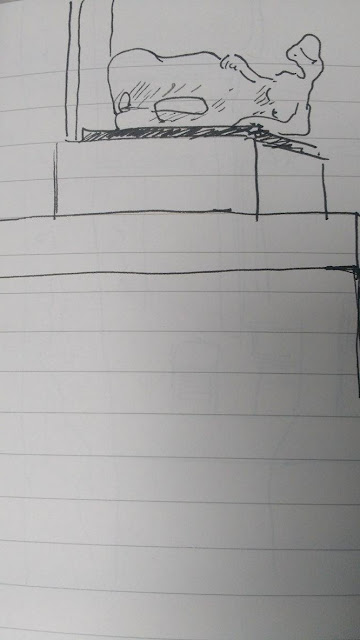
Henry Moore Institute- Prosthetic Limb Exhibition (and security guard)

The Headrow
Near My Flat
Near My Flat
Henry Moore Institute- Prosthetic Limb Exhibition and Other student
The Headrow
Henry Moore Institue- Outside
  
Henry Moore Institute- Prosthetic Limb Exhibition and Study of Two Other People
   
                                         
Leeds University Building                                           


I feel some of these drawings worked really well and I definitely became aware of the benefits of observational drawing through completing them, in particular the notion that it helps one visualize how a certain environment or physical position you had not previously considered actually looks, as is the case for my study of Matt drawing with his legs crossed ('Henry Moore Institute- Prosthetic Limb Exhibition and Study of Two Other People') which is one of my favourites from the set. There is also a certain urgency in the observational drawing of people due to the fact that one has no control over how long they may stay in any one position. One is forced to capture only what seems important in that instant, resulting in drawings which are much more intuitive in their physicality and yet were the result of a very focused thought process.  


This next set of drawings are consecutive repeats of the same image, completed from a reference photograph. The exercise involved studying the photograph for a brief period, drawing it from memory and then repeating that process so that with each new drawing one's memory of the image has been strengthened.


The drawings did improve after each look at the photograph which did not surprise me, however it was interesting to see how certain elements changed through these stages, in particular the face and facial expression and i do believe that the last drawing I did was the most characterful and the strongest, despite feeling that some of the proportions were better at earlier stages.  


After this process I completed another two drawings, again from a reference photograph, but this time with it in front of me so I did not have to memorise it.


I find it very interesting how the these two drawings differ so greatly from the first set stylistically. They have a much looser, cruder feel despite the fact that the image was available for me to look at as reference the whole time. I think that (for me anyway) when drawing from memory the mind becomes preoccupied with getting the image correct due to the lack of information available and as a result, the drawings are a lot more deliberate and precise because of this subconsciously occurring creative restriction. Once I have the reference material in front of me, I know I will not get the actual content of the image wrong in my drawing so I probably feel a lot more relaxed and thus my drawing becomes much more self interpreted.   


The final set of drawings documented in this blog are all observational drawings of a plant I had brought into the studio. With each drawing I attempted a slightly different approach in order to find the best way of representing the plant and the results are accordingly mixed stylistically, some much looser, some more careful and accurate etc.


I was happy with some of these drawings but cannot find a pattern to the certain styles which I feel worked best as my favourite ones are a mixture of careful drawings with a fine line quality and darker, looser ones using heavier brush strokes. The plant itself was fairly hard to draw and i had to find certain brush/pen strokes I could repeat in order to represent the leaves. I found scratchy, scrawled markings the best when using a dipping pen, and more slack, unanchored markings worked well when using a thicker brush. In particular, I enjoyed the inconsistency in tone which could be achieved through the use of a brush as it leaves some of the brush strokes visible, thus creating, in my opinion, a more animated drawing.


The following three drawings are examples of other students' work I found particularly effective.


In this study I feel the use of negative space has worked very well despite this particular plants shape being very dense. The more intricate parts of the drawing contrast quite dramatically with the majority if it's composition ultimately creating a very convincing drawing. 


This drawing is an example of what I mentioned earlier in terms of inconsistencies in the tone and density of the ink. I really like the slight smudges and imperfections and the way in which some darker brush strokes have been used very sparingly to pick out certain areas in the foliage, which is predominantly very delicate and faint. 


This last drawing is very simplistic in the application of line but as a result of it's conservative nature I feel it appears rather elegant. I also like the composition and feel it sits well with the clean reserved character.