Monday, 19 December 2016

Visual Narratives - 'Space' - Artist research

I have narrowed down the theme of my project to the abstraction of elements in a space. Specifically, the way in which a certain view (e.g. close up, upside down etc.) or perspective can create an abstract image through the removal of contextual information, and how framing a view (e.g. looking through a window, a doorway or any hole or gap) can transform a three dimensional space into a two dimensional composition. 

Below are some examples of drawings I've done which express this notion, or variations of it, throughout various stages of my thought process, beginning with some from my trip to the 'Yorkshire Sculpture Park' where I first began to think in this way, leading up to a small zine I made once my ideas had solidified somewhat.


Looking through a gap in bridge, still
containing quite a bit of detail and three
dimensional depth (YSP). 


Looking through a Henry Moore,
becoming more abstract but still
contains identifiable objects such as
trees. 


Looking through a Henry Moore hole,
again still identifiable shapes such as
a gate.
    

Looking through a Henry Moore hole,
the most abstracted drawing so far, the
shapes are about as simple as I could
have made them.


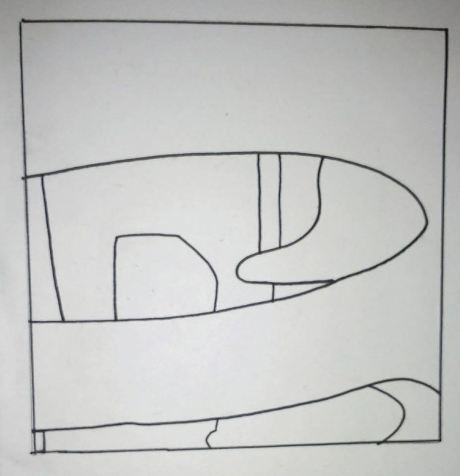
View of the kitchen through a hole in a chair. This is
becoming more of the kind of image I want to be
making, the simplification of the view and the unusual
framing working together to create a very obscure
composition.


View from my bedroom window. Again,
this extremely abstracted depiction of the
street outside (including parked cars and
buildings/ skyline) is more sort of the
direction I want to go in, although the
framing isn't as interesting in this drawing,
the abstraction itself feels more forced
rather than simply occurring naturally as a
result of a restricted view.


I have since been investigating some artists who might have taken similar approaches, or created similar aesthetics within their own work. Firstly, I have been looking at the work of 'Atelier Bingo' (the combined effort of Maxime Prou and Adele Favreau).


Their work is comprised of very bold simple shapes formed from what often appears to be cut paper compositions. I am not sure exactly where they garner inspiration from, I think their approach is in fact highly experimental and does not often necessarily have a specific theme which inspired it. In any case, they definitely seem to be more process driven than conceptually driven. 
At the moment I am working predominantly with line drawings but I think it would be extremely beneficial to start working with shapes made from cut paper and starting to consider colour, even if I still just draw to start with. I can see this approach working very effectively in my project as it seems to be becoming more and more shape driven. I will start experimenting with this approach, maybe replicating the same 'view' numerous times using different drawn and collage techniques to identify strengths and weaknesses of each.  


Another artist I have looked is Mishka Henner, in particular his book 'Less Americains, inn which he took a classic book of photographs named 'The Americans' by Robert Frank, and erased parts of each photograph to create new, strange and incongruous compositions. 


This work is no doubt controversial, Frank's book is one of the most revered photography books of the 20th century and Henner's use of appropriation and erasure has been viewed as insulting and "transparently absurd." I, myself could not be offended by it due to the fact that I did not know about the original book before coming across Henna's appropriation. Rather, I became interested in it because he deals with one of the themes I've have been considering myself - removing contextual information to create these strange abstract compositions. It's interesting how seemingly nonsensical these images become once the information which describes aspects such as depth or size is removed. The relationship between the shapes in the images is altered drastically in such a way as to pose a great challenge to the viewer's brain in trying to connect the seemingly disparate parts, and as a result forming new interpretations of the space.

I would like to experiment with a similar process, using my own photographs, and see if it leads me anywhere interesting.


Experimenting with Collage

I do to some extent enjoy working with collage or photomontage, and like a fair bit of other artists' work which is created in this way (e.g. Hannah Hoch and Anthony Zinonos) however, I have found it quite difficult, especially the idea of creating a specific amount to go in a book. My main issue is that I become sort of paralysed by the amount of scope one has when working in this way; resizing images, repeating images, cutting up images, which images to fit together, not throwing away any scraps because they might become useful etc. On the whole, I need to think less and just wack stuff down to see what happens, which would be ok, apart from the fact that in this instance I had a specific amount I had to complete, resulting in my finding it difficult to narrow down my ideas. As a result, I was not particularly happy with the results, but did find that the simpler ideas worked the best. Below are my three favourite outcomes.


Thursday, 8 December 2016

Visual Narratives Research Trip - Yorkshire Sculpture Park

Since deciding I didn't want to pursue the theme of swarms, I again was faced with the issue of having a very open subject to tackle ('space'). I decided eventually that the Yorkshire Sculpture Park might be a good place to visit in relation to space, purely because it has outside, inside, enclosed and open spaces, and, of course, sculpture, which often interacts with space in significant ways. This might be simply the fact that a sculpture is filling a space, or that the sculpture includes interesting spaces or use of spaces in it's construction or placement.

Seeing as I hadn't yet narrowed my theme down a great deal I had no real starting point once I arrived, other than to wander around and do some observational drawing to see what happened, if anything. There was an exhibition on of work by the Swiss artist - 'Not Vital' which was comprised of mainly sculptural/ 3D works, and I began drawing them. This is where I began to narrow my theme down to some more concrete ideas. 
Firstly, whilst I was completing drawings from his work and it's placement in the exhibition space, I began to feel uncomfortable basing my own image making and ideas on another artists work. I therefore started trying to obscure the fact that these were drawings of sculptures by drawing from perspectives which might abstract the view, resulting in the creation of drawings which were contextually elusive and shape based. 
This approach lead me to to explore further the notion of perspective within space, and what the image maker's view or perspective of a space can do for the composition of an image. 
I started to do observational drawings looking through holes (in objects such as Henry Moore sculptures) and windows or other general structural gaps, which created very unusual depictions of whatever view I might be studying, again often simplifying the shapes down to further interrogate the compositional elements of that view and increase the ability of a drawing to retain interest and exist in it's own right, without contextual information required to evaluate it's effectiveness.
I did explore other methods of drawing/ recording information such as sound mapping and collecting ephemera but found they became fairly redundant once I had latched onto this train of thought. 

I have been left with several roads I might want to take with regards to my picture book, all under this overarching theme of perspective/ view and how it changes the appearance of a space, or how it can be used to abstract a space to create interesting compositions and imagery:

Looking through holes (e.g. windows, doors, structural gaps etc) and how that creates or alters a certain view. Also, since the trip, I have been thinking about how framing a view (e.g. through a window) flattens perspective, converting a 3D environment into a 2D composition which could be expressed through simplistic shape driven imagery.

What are the compositional elements which constitute a 'nice view'? Can they be found in unlikely places (e.g. inside, in the corner of a room).

In general, removing context and detail to create abstract compositions.                           

Sunday, 4 December 2016

Visual Narratives - 'Space' - brief - initial thoughts

I've picked the word 'space' as a starting point for this visual narratives brief. One of the main reasons I decided on that word is because it's so open, although I have decided that I want to consider it in terms of three dimensional space not outer space. I have actually found that it's openness makes it quite challenging to tackle as a subject. It also makes conversations about it difficult as well; it being quite an abstract concept in many ways means that people either seem to struggle to keep up conversation about it, or they pigeon hole it into something very literal (which is not necessarily a bad thing). 

Nevertheless, over the first day or two I did start to generate some ideas, or come across notions that i think could be explored further. There were a couple of things that came out of the first few conversations I had with people that I thought could be interesting. 
Firstly I was discussing with someone how very busy spaces such as supermarkets or department stores can, due to the disassociation created between oneself and the mass of other people filling that space, become dehumanising to some extent. Sound in busy spaces can become a sort of white noise, and similarly, visually, one stops considering the people around oneself as they create a sort of mass of shapes and obstacles one might have to navigate.
Someone else said in conversation - "do you ever worry that there won't be enough space?" This question wasn't elaborated upon and no specific location or event was given and I found that as a result it was quite funny in its incongruity. I felt like it had potential to form the basis of a picture book but couldn't quite put my finger on why.
Another notion arising from that same conversation was how people and animals sometimes put themselves in situations/ spaces which are actually very uncomfortable or difficult or even dangerous. This was sparked by discussion of an episode of 'Planet Earth II', a portion of which was dedicated to the world's largest penguin colony on Zavadovski island. The penguins had to risk their lives every time they ventured out to get food due to their only route off the island into the sea was to sort of jump/dive out over jagged rocks into very choppy water, even during storms. 

I happened to watch another episode of 'Planet Earth II' which had a bit about a massive locust swarm and how it devours everything in a certain area/s. This lead me to think about how a space is changed or altered by whatever inhabits it, and thought that locusts, how different a space appears after a locust swarm has passed through it and eaten everything and the notion of a swarm in general could make for an interesting topic for a picture book. I had an idea of how a series of aesthetically pleasing images could be created based on the notion of a swarm using very simplistic imagery; employing the use of uniform dots for the swarm, positioned differently over a square (representing a patch of land), and scribbled up some examples in a notebook.


I realised that having an idea this fully formed was jumping the gun massively so left it and thought I might just start researching swarms, or locusts in general.

I have discovered since that the places I might be able to visit which would be relevant to this focus (Sheffield butterfly house, Tropical world) all seem a bit naff or designed predominantly for children and would probably not be that actually be that great for research. I have since abandoned this idea and will start fresh again with new lines of inquiry. 


Wednesday, 30 November 2016

Messing around with photoshop


I used three ink drawings of a plant as a basis for experimentation in Photoshop. I'm not very proficient at using Photoshop so the results aren't particularly good but I do quite like certain elements of each outcome and it was a useful exercise. I don't feel like I would often use Photoshop to create work, or that it would become integral to my practice, as I don't really like computers and, more importantly, don't ever feel free or inspired to create work when I'm looking at a screen. It seems to sap my energy a little I find the act of physically creating work with more traditional media much more enjoyable and even cathartic. However, I have definitely become aware of the benefits of using Photoshop to edit, enhance or tidy up work after I have made it physically.       


Original Ink Drawing 1

Original Ink Drawing 2

Original Ink Drawing 3

Photoshop Experiment 1

Photoshop Experiment 2

Photoshop Experiment 3

Photoshop Experiment 4

Photoshop Experiment 5

Saturday, 19 November 2016

Shape

Here are some photos of my attempts to represent a banana through drawings made from cut paper. It took me a little while to get past the obvious ideas and start trying to imbue the drawings with some kind of character but once I loosened up and started cutting out more exaggerated shapes less carefully I ended up with some results I was happy with, and one I was really happy with.


Made from some off-cuts left over from 

other drawings.
   
Attempt at a banana skin which somebody might slip on.
My favourite banana drawing. 


Self Portrait, with emphasis on shape and texture

Here is a drawing of myself made up of cut paper with different textures added using mainly black ink. I am pretty happy with the result, although I always think that my face has several distinct, and thus, easy to caricature features which perhaps makes it a lot easier to create a recognisable representation of myself. I sometimes find it difficult to evaluate such exercises therefore, because it seems that as long as the drawing contains glasses, long hair and a moustache, it will prove an adequate depiction. I also wish that, for this particular drawing, I had played around with shape a bit more and tried to see how far I might push or abstract a depiction of my own face, especially given the fact that, as I just mentioned, if I included the key features I think I could have taken it pretty far and it would still have looked like me. 

I did decide to angle my head a little as
I learned that, often as simple a gesture
as that is where the personality can lie
in an image. I thought it was particularly
needed in this instance as I decided to
eyes. 
   

Saturday, 12 November 2016

End of module evaluation


Overall I am pleased with the work I have completed throughout this module; although I still feel like I could have done more with each brief. I find it difficult to condense my ideas down efficiently and the result of that has been that whilst I have produced work in sketchbooks which I have been very happy with, often those ideas, in my opinion, lose something on the way to becoming the final outcomes. For this reason I have not been particularly happy with any of the specific end results, aside from the typology poster- How to make toast. I think this is because when I was creating that final outcome, I remained very loose and relaxed in my approach and settled on a concept I was happy with, with relative ease, during the roughing stage.


I think in the cases of the other briefs I was much more undecided on where I wanted to go with regards to the final outcome and also found that, gradually, the idea of something being a final versioncaused me to work less freely and thus the work lost some of the energy I felt was present in quick sketches and ideas generation in my sketchbooks.

Another factor, which I feel may have impeded my work, has been the two week time limit on creating the work. I feel like I still need to get used to working in short timespans, developing ideas more drastically or radically within that amount of time in order to push it more to a point where Im happy with it, and havent lost momentum by the time Im creating a final outcome. For instance in my editorial brief; the landscape illustration of the girl avoiding cracks in the pavement I was happy with, and felt I had imbued with character, but the scary Mary Poppins, whilst being a drawing I still liked, felt rather stale after drawing it so many times in my sketchbook without actually changing it all that much. The square outcome I really wasnt happy with, it was very much a half- baked idea which, although had potential, didnt come to fruition in the end. I was running out of time and just sort of threw it together.

The editorial project also threw up some practical issues for me in that two of the illustrations I decided to draw twice as big and then scale down so I didnt feel confined when I was drawing them. I didnt realise that one of them was too big to scan in (girl), and I ran out of studio time to scan the other one in (Mary Poppins) so ended up having to take photographs of them and printing them off. 
As a result I felt like I ended up with a bit of a mess of outcomes, in inconsistent sizes and formats, and the whole project, despite fulfilling every requirement of the brief, didnt feel very finished.

I was happier with my book cover, and it was definitely the project that provoked the most thought and consideration in me. I had quite a lot of ideas bouncing around during this brief and only managed to narrow it down right towards the end, but I enjoyed it the most due to some of the concepts I was able to come with as a response. My only issues with my final outcome are ones related to the cover not quite fitting the book and becoming a little dog eared in the process of me wrangling it on. Other than that I was happy with design and execution.


Overall I very much enjoyed this module; the fact that the briefs were only two weeks and occurred consecutively in quick succession was challenging but kept me on my toes, and from getting bored. It was frustrating that I didnt feel I developed my ideas enough sometimes, but I feel I will get better at that with time and am not too worried about it. I also want to try and experiment with more processes as I mainly just worked in ink for this module. 

Friday, 11 November 2016

Judge a book by its cover - Final outome and thoughts

I was fairly happy with how my book cover turned out in terms of the design and print quality. I feel the texture in the ink drawing was retained nicely despite the image being inverted and printed out and that it felt quite smart and cohesive as a design. However, I did find some issues in that firstly, my book cover was too big to print off in one piece, so I had to fit it together by gluing it together over another piece of paper which didn't work all that well but was the best option I could see in the time available. Secondly, partly due to that first reason, it did not fit terribly well and so became a bit battered through the process of me trying to fit it onto my book. I also accidentally guillotined the top of my cover a little more than I meant to when trimming it down, so the blurb on the back feels a little to close to the top.

Front Cover


Back Cover
Blurb is too close to the top of page.

It looks a little battered and the glue didn't hold it too well at the joins. Printing on cartridge paper gave it a nice, smart quality, but the grain of that paper doesn't hold the ink well when folded so these white marks kept appearing along the folds. 


More evidence of 'cracks' in the surface of the ink due to folding. 


Judge a Book by its cover - photoshop stuff/ text layout

I had a mess around on photoshop with some practice images before working on my final cover, coming to the conclusion that inverting the scanned in images so that the 'cave painting' style drawings became white (on black) looked quite striking. I had tried some drawings in earthy colours with acrylic paint beforehand but they didn't look as bold and didn't suit being a book cover as well, despite looking more like authentic cave paintings.


I have decided that the best type layout is the second image down, ultra light with the title in the top left corner and the author's name in the bottom right corner. I feel like this layout is the most well balanced, and allows the image all the space it needs. I also toyed with the idea of using the dead animal image as the front cover but decided in the end that although that image has the potential to work on either the front or back cover, the other image of the two figures only really works for the front. Also, the dead animal image looks quite nice with a blurb above it. So, sort of by process of elimination, I've decided my final cover will have the two figures on the front and the dead animal on the back with a bit of a blurb. The spine I will keep simple, just writing in the same font all over. I decided that using a clean simple font, and the same font for everything was the best decision regarding type as the drawings themselves are quite loose and expressive. 

Tuesday, 8 November 2016

Judge a book by it's cover - final ideas


I have narrowed my ideas from the five roughs to two, both of which I want to try out. The first is a practical, more straightforward idea and the second is very conceptual and 'fine arty' and I'm going to do it mainly because I think it's a bit funny. 


Idea 1

My first idea for a final book cover originates, again, from the ideas of evolution and primitive instincts I talked about in a previous post, but takes perhaps a more literal approach. I will be using neolithic/ cave painting style imagery, depicting two figures (one attacking the other with a spear) on the front cover and a speared wild animal on the back cover (I still need to refine the drawing for that).                                                                                                                                              
Essentially, this will be the layout of my book jacket, although I will change the drawing of the bull/ bison because it isn't working at the moment. I'm thinking I might take a much more simple route and just draw one on it's back with it's legs in the air.
This layout is one I decided against as it didn't really work once the cover was folded around the book, however, the line quality is much more what I'm after in this image. For the layout pictured above I think the ink I used must have been watered down accidentally or something because I couldn't achieve the scratchy, dry brush marks like I wanted to. But when I did this rough I used ink that did give me that effect.

This was just a quick experiment where I messed around with the very crude photo editing on my phone (what I took the picture on). It's an extreme edit setting called 'lines' and one I would never usually consider using but I do feel it works quite nicely with this image. I still think I prefer the texture and line quality of dry brush though and will probably stick to something in that vein as opposed to this. Still, I do think it works nicely.