Impressively complex lino prints. Very thoughtful/ well considered. Bold use of colour. Yann Kebbi
"It’s a process I like as it forces you to simplify and it sequences the crafting of the image." Very expressive and atmospheric. Really nice use of colour.
Bruce Waldman
Very expressive monoprints. Nicely textured. Loads of energy in the marks.
I really enjoy the handmade, kinetic and expressive way in which Kebbi works, and the fact that despite incorporating many different colours, textures and qualities of line into his images they never feel cluttered or confusing. I also like how he doesn't realy too much on visual metaphors, or obvious jokes, he uses simple ideas and translates them into effective illustrations through his visual aesthetic. Harvey Schmidt
Harvey Schmidt is not a current illustrator, he was working from the 50s onwards, and I can't help but think you don't see editorial work in this vein these days. It's so expressive and the american football pieces (For 'Esquire Magazine' 59/60) are oil paintings, which seem to me to work almost as fine art pieces in that I think they are extremely expressive, powerful images in their own right, with or without the article. I love how visceral and textured they are and the limited colour palette gives them a sense of immediacy, as if they were created as impulsively and with as much blunt force as the game is played with.
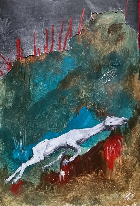
I decided to heavily emphasise texture in my zine (building it up with layers of paint, ink and pencil and scratching back into the page) in order to communicate the visceral way in which McCarthy writes, the physicality of the landscapes he describes and the violence which occurs in them.
McCarthy writes a lot about death and a lot about horses so dead horses became a recurring theme in my zine, as a simple way of evoking the nature of many of his stories. I tried to apply red paint to the images as a way to signify how violence is so deeply embedded into the world he depicts without just depicting violent acts.
I like how pairing quotes with images in a somewhat incongruous way can elicit certain atmospheres/ moods in an often more effective way than establishing more obvious connections.
I think this is my favourite page, it seems to me to be the most brutal image.