Tuesday, 28 February 2017

Stickers Progress


This is my first crack at a sticker design, depicting a headless greyhound representing the poor conditions in which racing greyhounds are kept. I really like it as a design, I still think i might need to isolate some areas a little more (by making more white or something) but I need to ask in the next illustrator session for some help with that.


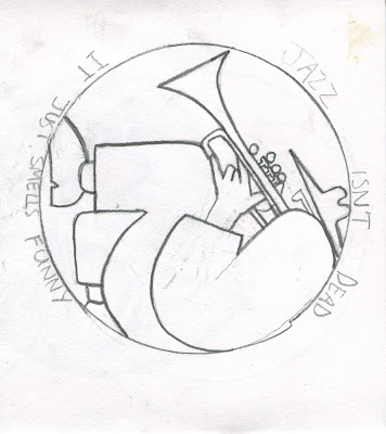
I've started creating this image in illustrator and I like the shapes I've used and the overall image but I'm not sure it connects that explicitly with the quote I was inspired by (jazz isn't dead it just smells funny). It seems like a bit of a cop out maybe to just have the quote written around the edge of a picture which only relates to the theme in a general sense. The idea which has inspired this sticker (and some other sticker designs I haven't tried out yet) - me wanting the image of jazz music to become less exclusive, and for it to be played in more places such as a bars and clubs as it was in the olden days when it was very much the peoples music, is a very difficult one to express in one simple image. This is probably why Ive been having to limit my ideas to fairly simple, generally jazz related images and hope the quote can help illustrate my point, even if it is somewhat indirectly.     
  

Saturday, 25 February 2017

composition - line of sight, perspective


Whilst I can see the use in cutting out shapes to construct pictures of landscape/ environment etc, I don't think I really made the use of this. It could give one, potentially, more freedom in constructing an image and help with envisioning depth. I think what I should have done was to use some more ambiguous shapes and buildings so I could have more fun playing around with different arrangements to find one which best exemplifies a sense of depth and perspective. What I ended up with was really just a cut paper version (although the shapes cut from paper were drawn on so it didn't even really have a cut paper aesthetic) of drawings I had already done, there wasn't really enough of a sense of depth and i hadn't considered where I wanted the eye to be lead either so the outcome is fairly weak overall.     

Composition - me, a butterfly and an elephant


This task was fairly challenging and I'm not sure i went about it in the right way really. I did, in some of the preliminary sketches, experiment with the inclusion of a landscape/environment to give some context to the image. I ended up leaving that out, though, in the final drawing in an attempt to focus more in the arrangement of the elements in it, which I now think was possibly a mistake. The resulting image, I feel, is not focused enough on composition in it's use of shape or space to work on a purely aesthetic level, and it doesn't include enough information to hint at a narrative or context. It's stuck in a sort of awkward mid-point between the two. I think in future, I need to consider that contextual information and physical presentation can help bring out the best in each other.       

Thursday, 23 February 2017

Environment, Character, Object - Forest, Fat Man, Torch


This was quite a challenge but I felt fortunate, with the selection I was given,  a forest and a torch are two things which might quite naturally be in the same scenario and it makes sense for a man (fat or not) to be holding the torch in such a scenario.  


I am pretty happy with the image I managed to come up and think I successfully married together the three elements into something which looks like there might well be a story there. The man's eyes looking up out of the picture in conjunction with the torch also creates quite a nice sense of intrigue. 
.
However, I'm not sure I really made the most of the fact that this was a brief with a focus on composition and I'm kind of annoyed with myself that I didn't try and use a more interesting perspective. There isn't much of a sense of depth either the image as a whole seems a little flat.    


acts of kindness - initial ideas

I've been finding it very difficult thinking up different kind acts that would actually make a good sticker idea and aren't naff so I think I'm gonna have to not take the brief too literally.
I've consequently been thinking about it more in relation to that Mahatma Ghandi quote - "be the change you want to see in the world", and not thinking about specific kind acts.

I'm still finding it difficult coming up with ideas but one that I've had that i do quite like is that I'd like jazz music to stop being seen as so exclusive. There was a time when jazz was the music played at clubs and bars etc, and whilst obviously I don't want jazz to be the only music played anywhere I don't like how it's become something which is commonly seen as 'musicians music' or sort of pompous. It's difficult to express that notion with just a picture however, although I found a Frank zappa quote - "Jazz isn't dead, it just smells funny" that I think works quite well as a way of expressing that idea. 

another idea I've had came from a flyer i must have been handed in town and stuffed in my jacket pocket without thinking. It's not something I would have considered otherwise. It was a flyer from 'Action For Greyhounds' which campaigns for the abolition of greyhound racing due to the mistreatment of greyhounds which is such common practice in that industry. I thought I could make quite a good sticker protesting the same thing.              

Tuesday, 21 February 2017

Final GIFs


I was worried that my digital GIF wasn't particularly interesting, and it isn't really. but I'm not particularly savvy with Photoshop so went for something very simple and I think it actually turned out pretty well. I also like how the action in this GIF repeats in a way that seems believable whereas in the other GIFs, the actions seem like something that would really only happen once and the fact that they're looped seems a little forced.     


This GIF was the most time consuming and the amount of frames that this ended up being meant that they didn't really have much time to properly explore many possibilities for the others. However, I do think it payed off and I am really happy with this, despite the fact it doesn't work particularly well as a repeating GIF, more as just a short animation. I think the slightly odd, very slow movements give it a very wierd eerie feel which was exactly what I was after. The inconsistencies in size and shape of the character also actually work as a strength as well I think. Because the movements between each 'mistake' or, change to the character's shape, are so fluid, it seems more like it is slightly morphing or something, and heightens the strangeness of it all.       


My 3D is definitely the least successful of the three and it could have probably used more planning. I do still think the look of it is quite good and the use of negative does make the bed sheet look more like a landscape, and overall makes the imagery seem a little more alien. Unfortunately, I was only using my phone to take the pictures and so had to set it up in a sort of box/stand thing I made to try and make sure it would stay still, and it didn't work, hence the massive jerk at the end. I should have planned a little better and borrowed a camera and tripod from college maybe.      


Wednesday, 15 February 2017

GIF development

I set up a mock of my 3D GIF using the practice model I made to see how the lighting might work and how I could frame the animation in the lens. I also converted the photo to black and white as I thought that would work well atmospherically.


Using bed sheets to create the impression of a landscape does actually work pretty well. Whilst i am happy with these results I do think there is a risk that in black and white, the images may become a bit unclear. 

Once I'd taken some practice photographs I started messing around with them on my phone with the rudimentary 'editing' software that's built in to it, including converting it to negative, which I did for a bit of a laugh really. I wouldn't usually go in for such a drastic effect. 

However, i actually really like the look of the negative photograph, and it just so happens that the colour of my duvet, once inverted, becomes a sort of sandy colour which could further imply a sort of alien, desert landscape. My character also stands out a lot better which would mean, I would presume, it's movements would be clearer.


Friday, 10 February 2017

GIF test - hand drawn, walking


I put together the first 25 frames of one of my GIFs to see how well it was working and I'm actually fairly pleasantly surprised. Thinking about, and drawing, how a person walks is very difficult I found and I thought that I'd put all the frames together and play them and it would look clunky and not very convincing but actually the movements are quite smooth. I like the fact that it's quite slow as well, it makes the character seem all the stranger and sort of ethereal which is in keeping with the feel of the track. I also think the movements of the feelers are quite good. I was a little concerned about them as I didn't have a definite plan for each movement they would make, I just sort of made them up as I went along but they look nicely fluid and sort of natural.        

Thursday, 9 February 2017

GIF/ character development, animation etc

I stuck with my idea for a sort of nomadic, wandering character and have since been developing the clothes, posture etc. 


I researched the types of clothes people who live a nomadic lifestyle wear in different cultures, deciding eventually to use loose nondescript garments and a sort of turban/ hat type thing. 

I was struggling the most with the design of the face. I think this because once a figure is given a face, that is what people will focus on. I was thinking that giving a humanoid face to the figure would make it too much like a human in general. The song made me picture something a little stranger/ more fantastical than that.

I decided to go pretty basic and refer to the title of the track, 'Moth', for further inspiration. In hindsight this seems a bit lazy, but my ideas did start to pick up again so I decided to run with it.


I used insect eyes and those furry feelers that moths have, but couldn't really figure out the rest of the face and thought it looked a little weak just having them sat on a sort of blank template shape. I did, at this point, start thinking about putting the types of patterns and shapes found on moths' wings onto the clothing as well.


I decided the most important element of the face was the feelers, but that the furry ones were perhaps a bit much. I decided I would obscure the face but leave these insect feelers poking out. I think they have the potential to be fairly expressive in a way, and were definitely the most essential component for me. I wanted to hint at insect traits without having to be too explicit. I also found that blotting ink, and letting ink run in water on paper creates patterns which, again, hint at the patterns on moth wings without being to obvious. 

I am happy with how the character has evolved and using cut paper really helped me identify the key shapes needed to represent it's form. I think they will work best for the digitally 'drawn' GIF. I decided having the figure sat on a camel-type creature is perhaps not necessary but I may still experiment with it.


For the hand drawn GIF, I think Ill just have my character walking across the screen, I don't mind if it's a little flickery, as that will fit in the idea of how a moth moves anyway. It will be hard, though, I think to do this convincingly and I'm considering whether having the ink patterns might make it a little hectic if they change every frame, obviously I can't really control how ink runs. So I might have to tone this aspect down a bit. I have also considered having the walking character GIF used for the digital imagery instead of hand drawn, arranging cut paper shapes for the legs might be easier than drawing every stage, and the ink patterns would stay the same. 


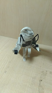
I made a three dimensional model of my character out of cut paper which I am fairly happy with, but it doesn't move, so I am going to build another one around a flexible wire frame so I can animate it properly. I'm still not one hundred percent sure what I might have my character doing in the three dimensional GIF, but other ideas I have for GIFs in general at the moment are sitting with only the 'feelers' moving around and falling down with exhaustion. I have had the idea to arrange the duvet on my bed to look like a desert landscape with which to place him in however.


I would stick some paper behind to act as a sky, probably black to imply night time, and maybe a moon as well. I intend to shoot i black and white, or rather, convert the images to black and white in Photoshop after taking them. 


Wednesday, 8 February 2017

GIF Test


Fairly happy with this practice GIF and it was pretty fun messing about trying to make it. I probably wont be using the same technique, however, for any of my actual final GIFs because anything much more complicated than this would prove difficult I reckon. I think just importing the frames and placing them in the timeline in the right order after already having made the images will be much quicker and easier than actually making the images in Photoshop.